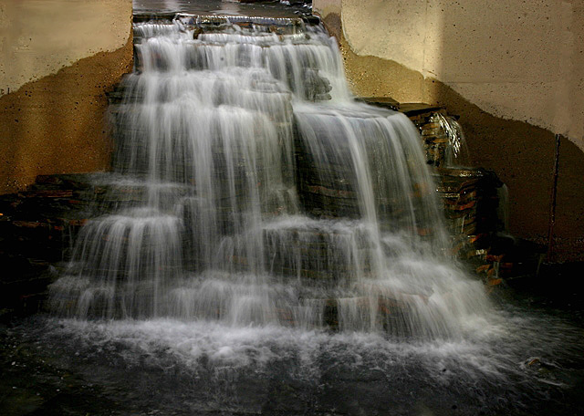
The lighting looks a little odd here, some strange shadows are on the wall. I'm trying to find any element of beauty in this shot but can't quite find it. Compositionally seems a little awkward.
(I'm writing this to everyone who submitted a landscape shot) The challenge was to produce a shot worthy of a magazine cover but to me a shot like this is not suitable to be put on a "portrait" format magazine.
As for the photo itself, I love waterfall pics wiht a bit of blur on the flowing water.
---ADDITIONAL---
Due to forum discussions and accusations that marking landscapes down is nitpicking, I'm going through them and remarking. I still think some of the landscapes would not make good covers because of their orientation but I am no longer marking down because of that.
I still think landscape is inapropriate for the majority of magazines but I'll give the benefit of the doubt to the photographers.
This shot looks tilted to the right. I would straighten it. The concrete wall really adds nothing to the shot. Although I think the lighting is less than ideal, I think the shot could be helped a lot simply by cropping this to a portrait layout, focusing in on the waterfall and leaving out the concrete wall.




 Add photograph to your favorites
 Add photographer to your favorites


 Photographer found comment helpful.


