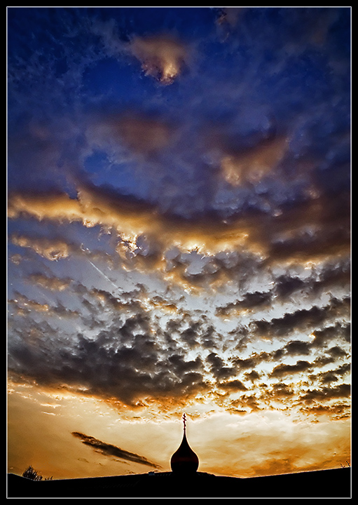
Given that this was Advanced editing, I'd have cloned-out the bright contrail at the center-left -- it seems to distract from the overall "flow" of the eye through the picture. Otherwise, it's an effective use of negative space and has great colors.
The composition really is excellent. Perfect with the centering of the mosque's spire but kept off kilter a bit by the shape and direction of the clouds. Nicely done.





 Add photograph to your favorites
 Add photographer to your favorites

 Photographer found comment helpful.


