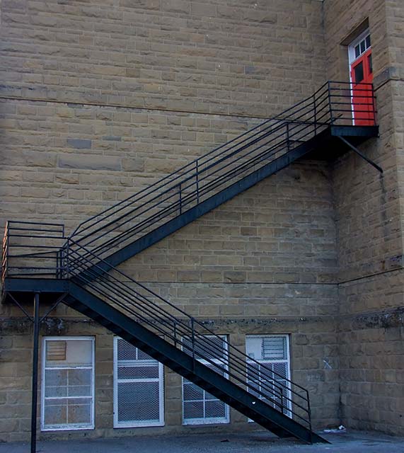
Not a bad effort, but there's some perspective distortion on the right that hurts the impact of the strong lines. Adjusting curves to bring out the colors and detail of the brickwork would also help give this some oomph.
Cool, meets the challenge. I would like to have seen this shot from a little more to the left so that you could see more of the red door which is, I assume, the intended focal point.
this is my favorite interpretation of the challenge so far. however the editing i feel could be a little more creative and the composition could be improved upon





 Add photograph to your favorites
 Add photographer to your favorites


 Photographer found comment helpful.


