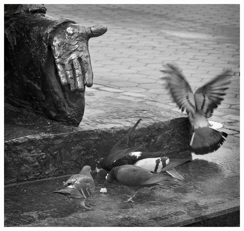
To each his own - the fluttery bird *makes* the composition, for me. :) Square crop seems absolutely right for this composition, demands it even, which is more of a gut feeling - I couldn't tell you exactly why that is so. Again with this one, I find myself wishing for more contrast - you seem to have a lot of midtone range here and not so much highlights and shadows, which leaves the b/w treatment feeling a bit flat. Now this could very well be a matter of personal taste - I tend to favor strong contrasts in b/w images.
I like the idea of the hand feeding and whilst I also like the right pidgeon in motion I'm not overly keen on the top right space, maybe a portrait shot with a lone pidgeon feeding would make this a much better shot?
This is so cool, it looks so much like the statue feeding the birds, yet we know it isn't. Besides the obvious idea of the hand feeding the birds, your title suggests so much more. Perhaps art is more than just something we do for fun...
Very funny and perfect title for the shot. I will agree that the bird in motion kind of distracts from the visual pun in this shot, but still a cool shot.
i'm a big fan of pidgeon shots, since they always go around looking like they're up to no good (check out my pigeons collection in my portfolio).
i think, in this case, the pidgeons need more contrast against the background since they are similar shades of gray. the best pidgeon in this shot is the one that's got its wings spread.
I'm not really good at well thought out comments. I just kind of type and hope people understand me.
Needs more pigeons! hehe ok with that said...
I personally think it is very cool that the hand is in the photo, making it look like the statue is the one feeding the birds. I also love the title - suggesting a deeper meaning to the photo.
THe hand is an obvious choice for a leading line, but the fluttery bird destroys the compoisition, and the ligher street in the BG pulls my eye. The flutter bird is also too far off the 1/3 line - perhaps if the other birds were not there...just too much going on and you've not composed it so that the view knows what you want them to look at.
I like the feel in this one, the motion blur is great too. Seems just a hair flat in the contrast for me however, especially for this kind of photo. overall awesome work
my kind of shot: no point of focus, just an energy that passes between shapes. when I wrote stories I would often be concerned about themes and have no regard for plot. That's what this story reminds me of.
It's ironic with the statue's hand. I could find myself more interested if it was a real hand - back to leaving questions in the viewers mind. A really interesting live hand would lead to all sorts of questions - who's the person, where are they. Least for me.
With the statue I see a pun, chuckle and mentally move on. With a small glimpse of a real person, I might linger longer.
I like it okay.....there are some composition issues that I can't exactly put my finger on, which I know is no help.....8>) I think the bird with the other three with its wings up bugs me.
Awwww. . .I love this! What a perfect capture. It grabs me on an emotional level. I just love bird photos anyway, but the symbolism of that hand reaching out as if it were in fact feeding them. Awesome!
How perfect! What a great shot! Did you plan this or was it a coincidence? The first thing I thought of was Mary Poppins and the song about feeding the birds.
You remind me that one of the best props of an urban street photographer is a pocketful of bird seed (I'm not kidding ;). Trying to figure out where this location is.




 Add photograph to your favorites
 Add photographer to your favorites

 Photographer found comment helpful.


