The image was incorrectly was titled "White House" because it actually depicts the Capitol building.
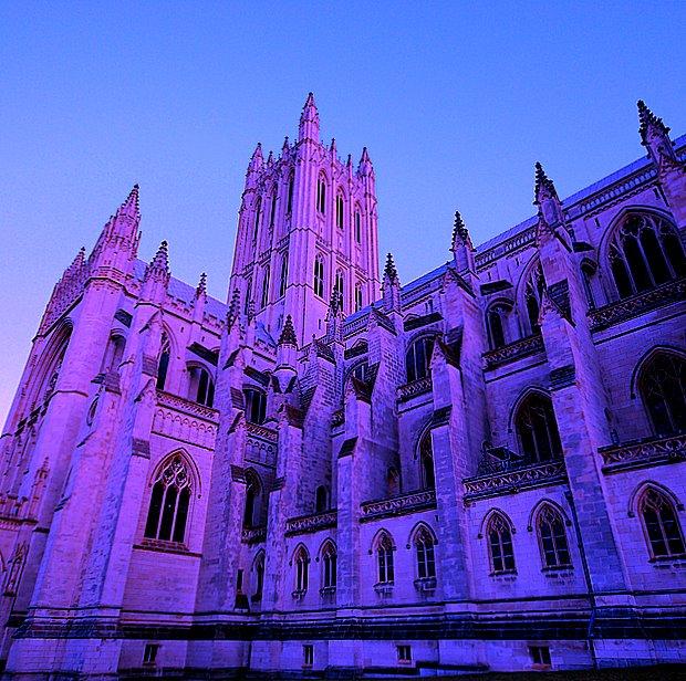
Of course, what I have is the Washington National Cathedral.
The editing steps were simple - straightened, sharpened, cropped, added some saturation. I also used the natural color picker tool to make the image purplish. Hopefully this is within the bounds of the advanced editing rules.
Statistics
Place: 62 out of 73 Avg (all users): 4.6889 Avg (commenters): 4.6667 Avg (participants): 4.4000 Avg (non-participants): 4.8105 Views since voting: 897 Views during voting: 243 Votes: 135 Comments: 7 Favorites: 0
**Critique club**
while I dont understand the title(even after reading) I am just going to give you a few suggestions on the photos merits. I dont include the title in my voting process, so I wont include it here.
while this is a good photo of the cathedral the colors just arent appealing at all. I think the use of oranges and reds wouldve been better and wouldve given this photo more of a real sunset feel. while the purple is "pretty" it just doesnt go with the building at any time of day and it just too unreal for voters. I think the color you chose was actually the downfall of this photo. I think everything else is perfect except the color.
~~Cher~~
the original was technically much better (except for the too soft focus), it only failed because most people didn't see how it met the challenge. this here is just overprocessed and grainy






 Add photograph to your favorites
 Add photographer to your favorites

 Photographer found comment helpful.


