| Author | Thread |
|
|
03/05/2008 10:34:47 AM |
**Critique club**
while I dont understand the title(even after reading) I am just going to give you a few suggestions on the photos merits. I dont include the title in my voting process, so I wont include it here.
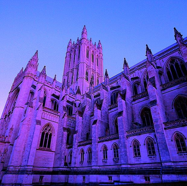
while this is a good photo of the cathedral the colors just arent appealing at all. I think the use of oranges and reds wouldve been better and wouldve given this photo more of a real sunset feel. while the purple is "pretty" it just doesnt go with the building at any time of day and it just too unreal for voters. I think the color you chose was actually the downfall of this photo. I think everything else is perfect except the color.
~~Cher~~ |
|
 Photographer found comment helpful. Photographer found comment helpful. |
Comments Made During the Challenge  |
|
|
02/27/2008 04:55:42 PM |
|
Color not to my liking, but you can't please everyone. I feel as if the building is collapsing in on itself...look at the foundation angles. |
|
| Photographer found comment helpful. |
|
|
02/23/2008 09:08:45 AM |
|
LOL - I recall that the original in this wasn't of the White House, either. So even though it's a shoehorn, it's a good one in this case. |
|
| Photographer found comment helpful. |
|
|
02/23/2008 02:29:06 AM |
|
Even thought the purple is pretty, I dont really like it very much. I think this could have looked great in a high contrast black and white. |
|
| Photographer found comment helpful. |
|
|
02/22/2008 04:41:20 PM |
|
I'm not so sure about the purple, but a neat interpretation of the original. |
|
| Photographer found comment helpful. |
|
|
02/22/2008 02:41:37 PM |
|
The colors make this not quite as good as the original in my opinion. |
|
| Photographer found comment helpful. |
|
|
02/22/2008 03:35:58 AM |
|
the original was technically much better (except for the too soft focus), it only failed because most people didn't see how it met the challenge. this here is just overprocessed and grainy |
|
| Photographer found comment helpful. |
Home -
Challenges -
Community -
League -
Photos -
Cameras -
Lenses -
Learn -
Help -
Terms of Use -
Privacy -
Top ^
DPChallenge, and website content and design, Copyright © 2001-2026 Challenging Technologies, LLC.
All digital photo copyrights belong to the photographers and may not be used without permission.
Current Server Time: 07/01/2026 06:29:01 AM EDT.