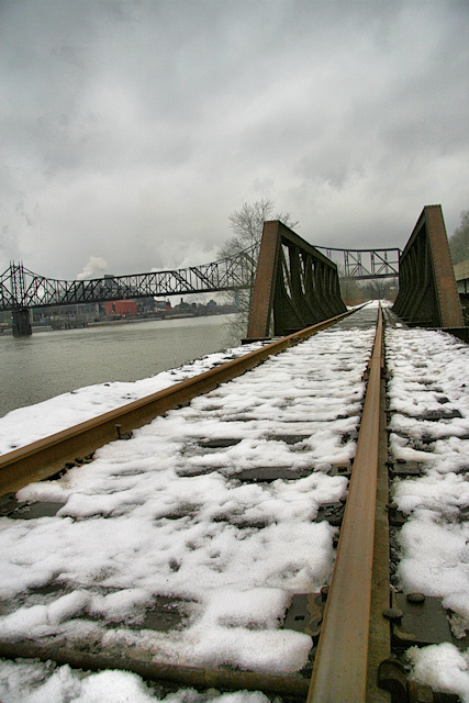
I really like the perspective view here. Three nitpicks though.
1) colors need bumping up a little for impact, probably with a curves adjust would do nicely.
2) the skew needs to be a little more, so that it is obvious that it is intended, or straightened out.
3) crop a little more out of the sky, so that the horizon and subject are not so centered. |






 Add photograph to your favorites
 Add photographer to your favorites


 Photographer found comment helpful.


