| Author | Thread |
Comments Made During the Challenge  |
|
|
02/26/2008 05:04:24 PM |
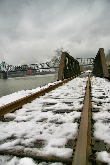
I really like the perspective view here. Three nitpicks though.
1) colors need bumping up a little for impact, probably with a curves adjust would do nicely.
2) the skew needs to be a little more, so that it is obvious that it is intended, or straightened out.
3) crop a little more out of the sky, so that the horizon and subject are not so centered. |
|
 Photographer found comment helpful. Photographer found comment helpful. |
|
|
02/24/2008 11:49:53 PM |
|
| Photographer found comment helpful. |
|
|
02/24/2008 10:26:54 PM |
|
Good job on levels ... sky is perfect love the rail |
|
| Photographer found comment helpful. |
|
|
02/21/2008 02:34:53 PM |
|
the tilted horizon is a little distracting |
|
|
|
02/20/2008 08:19:00 PM |
|
Nice idea but my initial reaction was that it was uninteresting. It grew on me a little as I looked at it more. |
|
| Photographer found comment helpful. |
Theme:
Classic /
System /
Light /
Dark
Home -
Challenges -
Community -
League -
Photos -
Cameras -
Lenses -
Learn -
Help -
Terms of Use -
Privacy -
Top ^
DPChallenge, and website content and design, Copyright © 2001-2026 Challenging Technologies, LLC.
All digital photo copyrights belong to the photographers and may not be used without permission.
Current Server Time: 10/04/2026 06:21:48 AM EDT.







 Add photograph to your favorites
 Add photographer to your favorites


