| Author | Thread |
|
|
03/24/2004 10:47:36 AM |
|
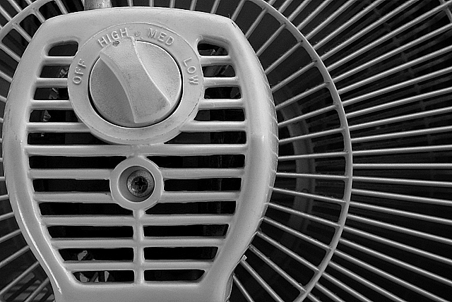
Not to nitpic jbeazell, but look a little closer to the entire image. |
|
Comments Made During the Challenge  |
|
|
03/23/2004 05:37:33 PM |
|
not to nitpic, but radial lines are not parallel. |
|
|
|
03/22/2004 03:04:15 PM |
Well taken, but might have been better moe centralized and a little further away.
Basically, not enough interest. |
|
 Photographer found comment helpful. Photographer found comment helpful. |
|
|
03/20/2004 04:10:38 PM |
|
Very nice composition, I would have liked a little more contrast personally i.e the blacks really black and the whites a bit whiter. Good submission |
|
| Photographer found comment helpful. |
|
|
03/19/2004 10:52:35 AM |
|
nice & simple & effective...nice job |
|
| Photographer found comment helpful. |
|
|
03/19/2004 06:09:49 AM |
|
Cant get very excited over this one. The idea is maybe good but it dont cach my eyes and I dont find it very creative. |
|
| Photographer found comment helpful. |
|
|
03/18/2004 11:43:45 AM |
|
i have not really been liking the shots of everyday items which happen to feature parallel lines but this one is a cut above. well seen and composed. |
|
| Photographer found comment helpful. |
|
|
03/17/2004 12:15:18 PM |
|
Rule of thirds used... the lines are parallel... and the contrast looks good. It still seems to be missing something... maybe a complete conversion to black and white? Is it too gray? |
|
| Photographer found comment helpful. |
Home -
Challenges -
Community -
League -
Photos -
Cameras -
Lenses -
Learn -
Help -
Terms of Use -
Privacy -
Top ^
DPChallenge, and website content and design, Copyright © 2001-2026 Challenging Technologies, LLC.
All digital photo copyrights belong to the photographers and may not be used without permission.
Current Server Time: 06/28/2026 08:47:40 AM EDT.