| Author | Thread |
|
|
02/20/2008 08:17:32 AM |
|
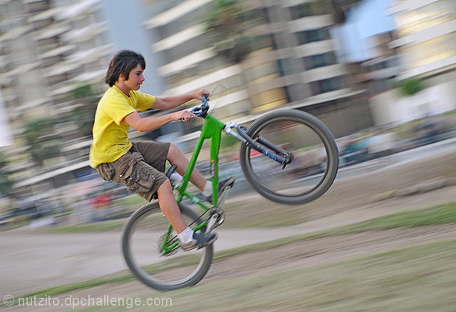
Great capture of sheer concentration and determination. Love the angle and composition as well. |
|
 Photographer found comment helpful. Photographer found comment helpful. |
Comments Made During the Challenge  |
|
|
02/19/2008 09:56:22 AM |
|
Very nice shot, very funky. |
|
| Photographer found comment helpful. |
|
|
02/19/2008 09:49:31 AM |
|
The background is rally nice looking nice picture. |
|
| Photographer found comment helpful. |
|
|
02/19/2008 09:43:30 AM |
|
I like the perspective but the whole thought of the image is lacking a lot of thought. Maybe a different background |
|
| Photographer found comment helpful. |
|
|
02/19/2008 01:26:21 AM |
|
Very cool image, but I don't like seeing the buildings crooked like that. |
|
| Photographer found comment helpful. |
|
|
02/17/2008 06:36:28 PM |
|
good use of panning and with the angle of the photo it grabbed my attention |
|
| Photographer found comment helpful. |
|
|
02/15/2008 08:02:41 PM |
|
Really nice job cropping this picture, i like how your subject is upright and not the buildings or ground. The blandness and neutrality of your background colors really make you subject stand out. |
|
| Photographer found comment helpful. |
|
|
02/15/2008 05:36:02 PM |
|
| Photographer found comment helpful. |
|
|
02/15/2008 01:43:16 PM |
|
Nice sharp subject and good background & wheel motion. Not sure how I feel about the tilt yet, if the buildings weren't in the background I might like it more. Colors are great. |
|
| Photographer found comment helpful. |
|
|
02/15/2008 08:03:30 AM |
|
| Photographer found comment helpful. |
|
|
02/14/2008 05:31:47 PM |
|
The highlight/shadow editing is a bit too much for this image making the colors look a little washed out. |
|
| Photographer found comment helpful. |
|
|
02/14/2008 02:20:24 PM |
|
looks like a little too much shadow/highlights. nice movement in the pic. the tilt works here. |
|
| Photographer found comment helpful. |
|
|
02/14/2008 08:46:46 AM |
|
Great sharpness on the face. The only other thing to mention really is the tonal range, could have pushed the bottom end a bit harder to increase contrast as the scene is a little grey and washed out. A bit more saturation to bring out the yellow and green would have strengthened the subject against a fairly neutral background |
|
| Photographer found comment helpful. |
|
|
02/13/2008 09:11:05 PM |
|
I like your background it suits motion. |
|
| Photographer found comment helpful. |
|
|
02/13/2008 08:13:31 PM |
|
| Photographer found comment helpful. |
|
|
02/13/2008 02:38:07 PM |
|
Excellent Image I love the motion.... |
|
| Photographer found comment helpful. |
Home -
Challenges -
Community -
League -
Photos -
Cameras -
Lenses -
Learn -
Help -
Terms of Use -
Privacy -
Top ^
DPChallenge, and website content and design, Copyright © 2001-2026 Challenging Technologies, LLC.
All digital photo copyrights belong to the photographers and may not be used without permission.
Current Server Time: 06/29/2026 02:53:00 AM EDT.