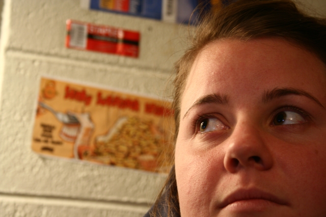
I gave this a 5. My wife had a good comment. The eyes were supposed to be the focus, but in this shot, the eyes point you away from them - they "give up" the focus rather than grabbing it.
Welcome to dpchallenge. There is lots of opportunity to learn here. Your shots so far show great creativity, and as you hone your technique, your scores will go up. (I'm still waiting for that to happen...but it will, I know it will... ;-p)
Like: Lighting on the left side of the face is nice, but a little harsh.
Dislike: This is more of a snapshot IMO. There is nothing that draws my attention to this photo for the eyes. The crop is too tight, the background is dull.
Face and eyes are a little too dark. As a result my eye is drawn to the sticker on the wall even though it is out of focus, just because it's the brighest area of the photo.
The background is distracting, and if that is what she's supposed to be pondering it should be clearer so we can tell what it is; if not it shouldn't be there. Personally I also don't like the cropped face, but I do like how she is looking into the picture.







 Add photograph to your favorites
 Add photographer to your favorites


 Photographer found comment helpful.


