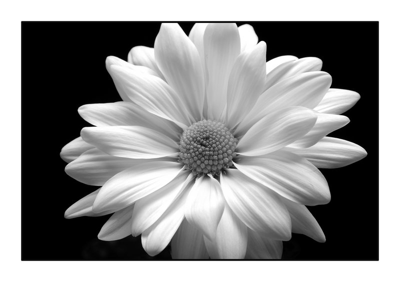
Shot in RAW at home at the breakfast table. I used it as something to manipulate and am teaching myself some CS3. I'm pleased w/the results. A couple of hot spots on the front petals so I have something to work on. Any advice would be awesome! Cheers!
I once saw someone asking in the forums why anyone would present a flower in black and white. This is the reason. Because then we can see it differently, more directly, for what it is. Lovely.
I'm a bit late with commenting this (and it's too late for me to read all the comments). First impression: wonderful image, sharp and nice contrasts, perhaps a little too centered. Thinks some of the white is a little "too white". Probably the light. Can't give you any solution, since I'm still having problems with that myself.
First - the detail you captured on the petals is excellent! They look so soft and the clarity of the picture makes me feel like I can actually reach out and touch them. Now I have a question about your processing. Did you use some kind of dodging on the center part of the flower? The dark area, dead center, pulled my eyes in and then I started looking just above and it looks like a white haze there. Like something is not quite right - but not so wrong that it ruins the picture. It's just something I noticed. Excellent job with the lighting!
_________________________________________________________________
Nope, didn't do any dodging but I did try to layer the petals and the center of the flower differently. I tried to enhance the color of the center (while it was still in color) and I put a sepia tint to the petals. The center of the flower is still green at the darkest spots and yellow in the other parts - see thumbnail image above. Thanks for your feedback!
First - the detail you captured on the petals is excellent! They look so soft and the clarity of the picture makes me feel like I can actually reach out and touch them. Now I have a question about your processing. Did you use some kind of dodging on the center part of the flower? The dark area, dead center, pulled my eyes in and then I started looking just above and it looks like a white haze there. Like something is not quite right - but not so wrong that it ruins the picture. It's just something I noticed. Excellent job with the lighting!
the joy and simply perfection of the flower really shines through - i am just unsure if i like the crop to leave out the tips of the petals at the top and bottom
Really an excellent control of the exposure - very hard to do well with white/light colors. A very good conversion - mind adding how you did it? And very crisp, very sharp.
Melethia, I set up a black foam board left/right about a foot away each side and a black drop cloth about 3 feet back. The daisy was on my breakfast table w/an incandescent ceiling fixture about 3 feet above it. I put a scrim across the top of the two foam boards to soften the light and act like a soft box, set a custom white balance of the light from the flower's position and metered w/a hand held light meter for the exposure. Metered in aperature mode (f11) to keep in the lens' sweet spot and focused on the front edge/petal (verified w/DoF preview).
Not sure I can properly describe the CS3 process except to say I was following textbook examples of converting an image to b/w. I'm trying to learn/teach myself so I'm just following recommended steps. Wish I could be of more help - hopefully this will be the case soon!
I agree about the hotspots. Always easier to get than to get rid off. Perhaps a kind of underlighting would help (but I'm not an expert) or some HDR thing (still trying to learn that myself). But, forgetting all that, it's a wonderful flower but indeed a little bit too centered.
Really an excellent control of the exposure - very hard to do well with white/light colors. A very good conversion - mind adding how you did it? And very crisp, very sharp.
methinks previous commenters have said it all! Welcome aboard to both the side challenge and dpc. In the right challenge (voters can be hyper about flowers) this would have ribboned imho.
My only thought though am sure you tried it would be to move the flower just a little more off centre than it is already. 'Simply beautiful' (a much better title than Daisy lol)
Exquisite! The detail is fantastic. It is easy to rely on stunning colors on flower photos, but this image creates a superb sense of elegance. Even dof throughout the image also makes it work. Well done.
Simple composition, accurate focus, suitable depth of field, and a creative eye yields a beautiful result, is what I am reminded by your photo. Selecting a good specimen for close up work is also essential (as you did). Better improve my standards via experimentation is also what I learn from this picture.
Red! Hi! A fellow San Antonian! I'm happy to have you here. A few of the other San Antonians have become life long friends of mine from this crazy wonderful site. And there's a couple from Austin that also hang out like family now :) Are you in the Air Force? Randolph? Verrrrrry cool! :)
This is beautiful. Perfect crispness. Perfect whites, blacks, grays. A lovely first week!
You did a great job. The whites came out very well with nothing blown out. With a flower like that it had to be a real challenge to do that. The contrast and detail are just great.




 Add photograph to your favorites
 Add photographer to your favorites


 Photographer found comment helpful.


