| Author | Thread |
|
|
02/19/2008 03:16:41 PM |
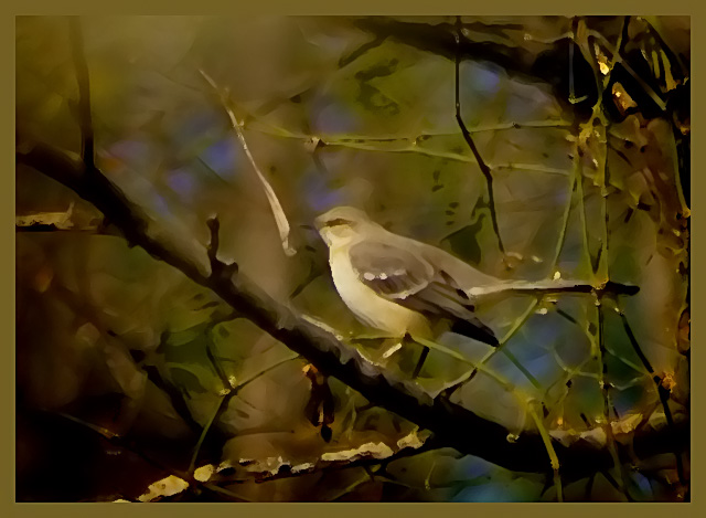
you may'v got a woeful score but its most definitely not a woeful image .. brilliant in fact .. excellent colours .. love the softness that the process gives this ... its like a beautiful painting ..
i really dont understand the ppl who say stuff like 'doesnt look like a photograph to me' .. when we do any processing we change the appearance of a photograph, its just a matter of degree .. ppl absolutely love the overlay/texture look for example yet they dont look like photographs either .. and there are heaps of stunning images in dpc that are nothing like the original photograph but ppl dont say 'doesnt look like a photograph to me' coz the processing is less obtrusive .. (couldnt think of a word there, so obtrusive will have to do ..!! ..) ..:) |
|
|
|
02/04/2008 09:36:23 AM |
|
I just read your post in reflections without mirrors and remembered this shot and also remembered I loved it. I am glad some people take chances with there processing it makes it so much more interesting to view. I can and can't beleive this finished so low. Its beautiful and well done so imo should have finished higher however I do know alot of the voters here don't like this sort of thing. I am definately not one of them and am adding this to my favorites. It really is lovely! |
|
 Photographer found comment helpful. Photographer found comment helpful. |
Comments Made During the Challenge  |
|
|
02/03/2008 11:55:53 PM |
|
Nice composition, but I'm afraid the post-processing effect applied here does not appeal to me at all. |
|
|
|
02/02/2008 12:01:04 PM |
|
I love the way you've processed this picture, the artistic filter really fits the subject matter. Too bad DPC hates shots like this, but maybe you'll prove them wrong this time out. Bumping you to an 8 just because I can. |
|
| Photographer found comment helpful. |
|
|
02/01/2008 09:44:18 PM |
|
Is that a mockingbird? Your heavy use of filters may be artistic but I am not sure it works for this photo. I want to see the detail of the bird. The composition with the bird sitting on a diagonal branch seems to work. |
|
| Photographer found comment helpful. |
|
|
02/01/2008 02:45:37 PM |
|
Personally I love this effect, I wonder how this will do with the DPC crowd... |
|
| Photographer found comment helpful. |
|
|
02/01/2008 10:11:19 AM |
|
Not sure such an effect is 'legal'. I would like to see the detail in the bird either way. |
|
| Photographer found comment helpful. |
|
|
02/01/2008 09:44:18 AM |
|
Not too fond of the processing. |
|
| Photographer found comment helpful. |
|
|
01/31/2008 07:37:28 PM |
|
I'm not a fan of this processing, this looks more like a painting then a photograph. As a painting this is nice, however this is a photography site. |
|
| Photographer found comment helpful. |
|
|
01/30/2008 09:40:29 PM |
|
aah. looks like a kodak digital gem special. i like it but know you are probably getting junk for it. keep up the interesting interpretations. |
|
| Photographer found comment helpful. |
|
|
01/30/2008 03:02:06 PM |
|
Not suited by the filter, but effective. |
|
| Photographer found comment helpful. |
|
|
01/30/2008 02:45:51 PM |
|
The filter used does nothing for me here. |
|
| Photographer found comment helpful. |
|
|
01/30/2008 12:34:48 PM |
|
I like the watercolor(?) effect. Was this done in photoshop? My only criticism is the with the border merging with the leaves in the top left. For me it detracts from an otherwise very nice image and composition. Good job. 6 |
|
| Photographer found comment helpful. |
|
|
01/30/2008 07:44:16 AM |
|
Looks like a glass window - very warm and rich. Probably too much processing for this crowd (unless it's a picture of a window!) |
|
| Photographer found comment helpful. |
|
|
01/29/2008 02:05:59 PM |
|
Very unique! Personally I don't find the processing to be as appealing, but I understand your desire to try and make your photo stand out (Which is does). |
|
| Photographer found comment helpful. |
|
|
01/28/2008 04:21:51 PM |
|
I really like this PP effort (7), unfortunately DPCers in general do not reward you for this kind of effort. I wish you luck. |
|
| Photographer found comment helpful. |
|
|
01/28/2008 04:00:59 PM |
|
Not much caring for the processing, which is a shame cause it looks like you had a good base to start with. Maybe it was too blurry or somethign to use as a straight edit. Bad border. |
|
| Photographer found comment helpful. |
|
|
01/28/2008 02:00:12 PM |
|
might get beat-up by the digital art police on this,i like where this was going too except for the muddy-spot on the upper left , 5 |
|
| Photographer found comment helpful. |
|
|
01/28/2008 11:26:53 AM |
|
well, ummm, it has been turned into a very nice painting of this bird. The more I look at it, the more I like it. Definitely out of the box. |
|
| Photographer found comment helpful. |
|
|
01/28/2008 09:10:57 AM |
|
The processing is waaaaay over the top for me. |
|
| Photographer found comment helpful. |
|
|
01/28/2008 08:37:25 AM |
|
'Fraid I'm going to have to go with the "too much processing" crowd. It just doesn't look like a photo to me. That said, the tones are nice and I might like it as a painting, but with a much darker frame (that's too muddy a brown to appeal to me). |
|
| Photographer found comment helpful. |
|
|
01/28/2008 07:37:10 AM |
|
too strong use of neat image or similar software. the blue in the imageis distracting. |
|
| Photographer found comment helpful. |
|
|
01/28/2008 05:58:25 AM |
|
| Photographer found comment helpful. |
Theme:
Classic /
System /
Light /
Dark
Home -
Challenges -
Community -
League -
Photos -
Cameras -
Lenses -
Learn -
Help -
Terms of Use -
Privacy -
Top ^
DPChallenge, and website content and design, Copyright © 2001-2026 Challenging Technologies, LLC.
All digital photo copyrights belong to the photographers and may not be used without permission.
Current Server Time: 10/02/2026 12:30:13 PM EDT.





 Add photograph to your favorites
 Add photographer to your favorites


