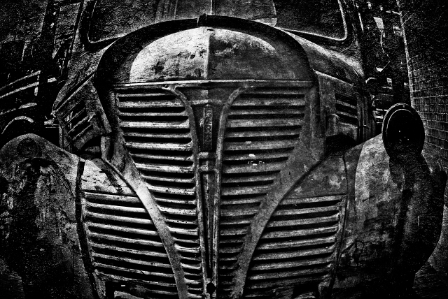
Maybe a bit much - that grille is something else, maybe worthy to speak more for itself. However, I love to see things like this that really push the envelope.
I think it's an interesting idea to use textures in black and white. For me tho, it now seems that there is too much to look at, and I cannot tell what really should be the focal point. I see the brick on the right and I'm curious as to what is hanging out on the left. As for the truck itself, I think that your overlay does a beautiful job of highlighting all the different components.
Think it was noticed, but perhaps it was a little early to start commenting. Not sure if all the overlays are helping, but there are a lot of nice patterns here.
I'll have to go check your portfolio to see, but this is one where I wonder if color might be even more impressive. The B&W does emphasise the lines well, though.
k, not quite what I expected in the first week of B&W (there I go again being purist lol). Am sure the truck could stand up without all the texture layers and as has been mentioned would like to see a straight B&W, either way its striking and am looking forward to more of your B&W work this year )
I like it! It takes on a whole different meaning than just a truck. The processing makes it art in its own right aside from it being a truck (well, that kind of made sense to me even if to no one else).
The texture overlays definitely have their place. I think they may be a little over-used these days -- but it does in fact work great for this one :)
I normally don't go in for PS wizardry but this does have a feel to it that I can relate to. Too many people use this stuff to "make" the image and I do think that truck face would have stood well all on it's own but I do think what you did works here. Cheers.
Interesting PP - it has appeal more as a painting than a photo to me. The textures have created a different sense than the straight photo. Excellent creativity.




 Add photograph to your favorites
 Add photographer to your favorites

 Photographer found comment helpful.


