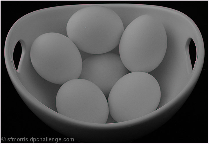
Very nice composition and framing--would like to see it a bit brighter, just seems a bit on the middle muddy gray side to me. A small tweak to a "high key" approach might make this image really sing!
I am seeing a purple fringe on the edges of the bowl--not sure why....
I like the composition and the black background. The grays seems a little...flat to me. Perhaps if there was a bit more light or highlights, it would stand out even more.
I like the subject and the centered composition - but the image seems a bit flat from a lighting perspective - I think an adjustment of levels would really help this one out. Also, there is a peculiar red halo around the edge of the image that is a bit distracting.
I was about to say the old chestnut, 'more light', when I realised I really actually quite like it! The muted tones make this simple and subtle, and I'm a fan :)






 Add photograph to your favorites
 Add photographer to your favorites


 Photographer found comment helpful.


