| Author | Thread |
Comments Made During the Challenge  |
|
|
01/29/2008 06:25:27 PM |
|
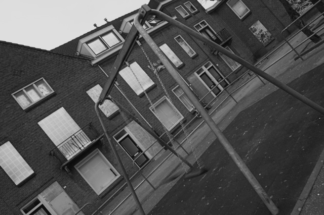
I am not sure how “ghetto” in the title is to connect with the picture subject. Interesting POV. |
|
|
|
01/29/2008 02:03:29 PM |
|
I'd like to see a little more contrast in the mid tones. I like your diagonal composition and the subject. |
|
 Photographer found comment helpful. Photographer found comment helpful. |
|
|
01/29/2008 08:14:36 AM |
|
Your title made me laugh, but your picture is a little depressing. Not that that's a bad thing though, I like your different angle that you choose to shoot from and the black & white adds to the mood. |
|
| Photographer found comment helpful. |
|
|
01/28/2008 10:28:30 PM |
|
The orientation of this photograph is disorienting. Also, the eye is drawn more towards the architecture rather than the swing. |
|
| Photographer found comment helpful. |
|
|
01/26/2008 06:44:37 PM |
|
Great composition. I'd would have like to have seen a little more contrast while maintaining the ghetto-ee b&w. |
|
| Photographer found comment helpful. |
|
|
01/26/2008 06:28:33 AM |
|
Quite dull tones, B&W always benefit from slightly clipped shadows and highlights to increase contrast and impact. A visit to the curves or levels shop during popst processing would have brought this to life |
|
| Photographer found comment helpful. |
|
|
01/26/2008 01:22:23 AM |
|
The angle is quite distracting. |
|
|
|
01/25/2008 10:33:48 PM |
|
Clever title. Like the angle too. |
|
| Photographer found comment helpful. |
|
|
01/25/2008 10:30:38 PM |
|
The tilt is entirelly unnecessary in my opinion. |
|
|
|
01/25/2008 03:32:54 PM |
|
This has very little contrast as a B&W photo |
|
| Photographer found comment helpful. |
|
|
01/24/2008 08:06:17 PM |
|
I'm not sure I understand the title... It doesn't seem to go with the picture! |
|
|
|
01/24/2008 07:24:11 PM |
|
An empty swing, how creative! The angle makes me feel like I'm going to fall over, I have to turn my head. The black and whites looks nice and the contrast is wonderful! The fact that the swing is blurry bothers me somewhat but over all, nice picture. |
|
| Photographer found comment helpful. |
|
|
01/24/2008 11:30:40 AM |
|
|
|
01/23/2008 05:46:05 PM |
|
Not quite sure what it is about this shot that could improve it. Perhaps, it's the angle and the blur to the swing motion???? |
|
| Photographer found comment helpful. |
|
|
01/23/2008 09:37:41 AM |
|
Home -
Challenges -
Community -
League -
Photos -
Cameras -
Lenses -
Learn -
Help -
Terms of Use -
Privacy -
Top ^
DPChallenge, and website content and design, Copyright © 2001-2026 Challenging Technologies, LLC.
All digital photo copyrights belong to the photographers and may not be used without permission.
Current Server Time: 06/29/2026 07:23:54 AM EDT.