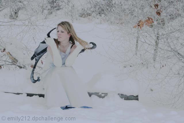
This would be an amazing shot if it had a few things tweeked. first, contrast, she's almost lost in the snow. and second, sharpen. other then that it would rock!
a few problems here. not sure why the slight brown tones are there, but they don't really work, and a vintage look is not at all in context here. you set the compression way to hight when you saved the file for web, creating blocky .jpg artifacts that are really distracting. the models pose comes up short, since she's not posed at all, really. There's no intentionality with this setup at all, besides the feat of getting the model to sit on a cold log in the snow in the first place anyways.
good concept. the pic is noisy though and the color seems a little off to me. one other thing is getting eye contact from the model. that would draw the viewer in better.
Image contrast here seems to be off, and it's overall too soft. There is a distracting yellowish color cast due to the contrast, too. Has the potential to be a great image if processed differently.
I like this shot alot but do feel that it would benifit from being a tad bit brighter. It almost appears to have been under exposed sinc ethe white appear grey.





 Add photograph to your favorites
 Add photographer to your favorites


 Photographer found comment helpful.


