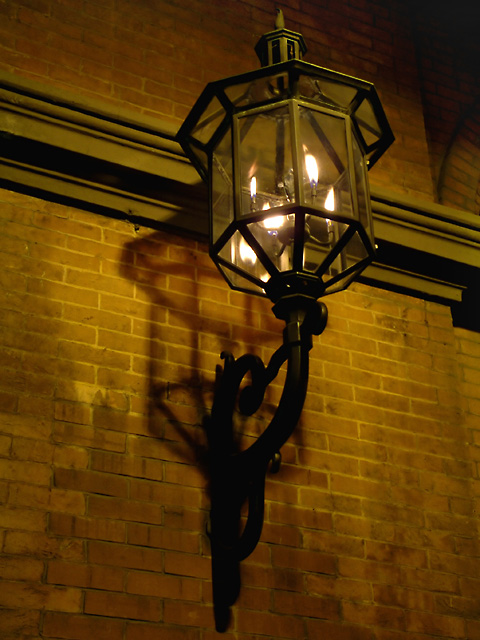
One of many at the Academy of Music in Philadelphia, PA.
Adjustment layers for levels, Brightness/Contrast, Hue/Sat. USM. Neat Image, Usm, clean remaining evident noise, resize, USM.
Statistics
Place: 40 out of 113 Avg (all users): 5.5111 Avg (commenters): 6.9167 Avg (participants): 5.4432 Avg (non-participants): 5.5761 Views since voting: 1262 Votes: 180 Comments: 13 Favorites: 0
Composition: Overall, the composition bothers me a bit. The rather straight vertical line created by the main subject and the horizontal movement created by the line crossing the frame make the unused parts of the composition stand out a bit too much to me. My eye is really drawn to the two large rectangles of brick in each of the lower corners, as oppposed to the subject.
Challenge: Fits the challenge very well. The lamp is quite pretty and it is a lovely, creative subject.
Camera Work: Nice job with the exposure, not letting the bits of fire get too blown out like we saw a lot of in this challenge. Sharp and clear in all the right places. Appears you've used a tripod. I do like the mood created by the several different points of light and the shadow. I see that you've altered the hue and saturation and find the orangish tinge a bit unpleasing to the eye - it feels more like the white balance is off than a deliberate. If it were a bit more on the blue side, it would evoke a peaceful feeling of nighttime and you might feel the need for the lamp a bit more.
My Opinion: Overall, I do like it, though I'd like to see some other shots of this lamp with different compositions to see what else you could do with it. I don't remember what I rated this when I voted, but I'd guess in the 6 - 7 range.
Very moody composition. Really like the great shadow captured of the lamp on the wall. I think the muted colors may turn people off to the shot. A little experimenting with monotone would give more impact to the shot. "8"
I love the tones and simple composition here! Very old time homey feel! You appear to be a little tilted though, enough to be distracting, but not enough to be 'artsy'...
TC
Lighting and composition is very good here. The digital "jaggies" at the top of the image are a bit of a distraction and hurt the overall quality of this fine photograph. Those digital artifacts can be smoothed out using about a 5 pixel brush with a blur tool in post processing. That would make the image even better than it already is.







 Add photograph to your favorites
 Add photographer to your favorites

 Photographer found comment helpful.


