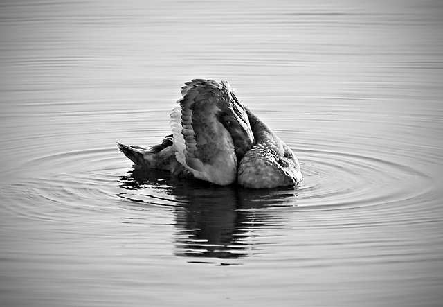
Editing: converted from RAW, monochrome conversion with channel mixer, USM, some dodge and burn, curves and levels layers, vignette (I agonised for literally days over adding a vignette, I hope I don't get flamed for it)
I have enormous affection for this photo. Its impact is not immediate, so I am resigned to see it pick up a mediocre score. But I'm entering it anyway in the hope that one or two people will get the same response from it that I do.
POST-CHALLENGE:
I really appreciate the extra comments that have popped up as a result of the "I really love my shot" thread. I can understand the ambiguity of the pose must have put some people off (even though it's one of a series of shots, I can't work out where the head is either!). I hope that more people like than dislike the centred composition - I'm not a huge fan of rules for rules' sake and I thought the ripples coming out from the swan justified it.
Statistics
Place: 253 out of 429 Avg (all users): 5.4078 Avg (commenters): 6.9167 Avg (participants): 5.2991 Avg (non-participants): 5.6129 Views since voting: 1143 Views during voting: 317 Votes: 179 Comments: 26 Favorites: 2 (view)
Missed this. The dpc size doesn't do this any favours: I have to do an imaginative interpolation to "see" the varied feathers and down that make this so interesting. I think the head is snaked around to groom the right underwing. Like dragon and food on platter intimations...
Wonderful photo. Unlike most of the voters, my only complaint is that the bird IS recognizable. Without the small tail giving away it's identity, this sea creature could have scored even lower, but would have been a better piece of art. Don't compromise your photography for a high DPC score unless you are doing it intentionally.
I do think it is too centered. I agree that the ripples are nice, so the centering works great right to left. Maybe if a little bit of the bottom was cropped it would have a little more punch.
I honestly wouldn't have known what this was without reading your description. I truly think this would have done much better if you could see the head. I really like the tone of this photo. The vignette is a nice, suttle touch as well.
Hmmm, I thought I commented during the challenge. I really like the tones here and the ripples. The interesting pose of the duck also works extremely well. It all leads up to a good picture. My only suggestion and it is quite minor would be to brighten up the duck just a bit while keeping the same contrast (I would like to see more of those whites).
OK let me be honest...I gave this a four and in retrospect I do think I was too harsh on it (sorry). There is a lot to like about this image, the centred composition, the ripples from the swans body. My 'problems' with it when I was marking it is that I found even when I looked at it quite closely although I knew it was a swan/seabird I could not really make out what was happening in the shot which was a bit unnerving and unattractive to the eye. Also because the animal seems to be mid moult the darkness of its feathers seems to blend in a bit with the surface of the water making it a touch flat and indistinct
Having said that I think that many people looking at this a second time would say it was worthy of a higher score than it had been given
I absolutely adore this shot and would have given it an 8, had I voted. I feel the simplicity and elegance of the composition is excellent. Clearly underrated and great material for a Posthumous ribbon, in my opinion. (Too centered... to shmentered - people need to get over that. Sometimes centered is appropriate, as in this case.)
I liked this,during voting, but think maybe it wasn't understood by many of the voters.
I think it worked very well in black and white, not sure that it would in colour.
The thing to notice here is the huge variance between the average score and the score from your commenters. You did indeed get a favorable response from quite a few people. In my book, that's a Free Study success! The toning here is lovely, the centered comp works because of the rings in the water, and the bird is quite elegant with very good detail. My only nit with it is where is its head? :-)
Great lighting and clarity. I like it in black & white - for me, its more effective. A little bit of darkness in all four corners (I'm sure there's a more technical term), but overall a nice photo.







 Add photograph to your favorites
 Add photographer to your favorites

 Photographer found comment helpful.


