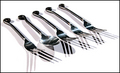
Great idea - really original - but the colours are just too muted for a shot like this, which I think really relies on colour to let the reader know immediately what the other objects are.
I think this is a very good concept, but somehow the execution is off. Maybe there are too many elements, or maybe it's a problem with the color balance?
i'll take the snickers :) very creative contrast. the snickers bar seems a little oversharp to me. i also like that you don't have the usual blinding white background.
HAHAHAHAHAHA....This is brilliant. Just BRILLIANT!!! The lines are done amazingly well, this is perfeclty composed and the subject...wow just perfect for this challenge.
Boy I bet that took some time.l I'll have the snickers when you are done. Hope you like carrots an celery. My only problem is the colour cast, too much yellow and orange.






 Add photograph to your favorites
 Add photographer to your favorites


 Photographer found comment helpful.


