| Author | Thread |
|
|
03/10/2004 02:54:17 PM |
Originally posted by steventhewriter:
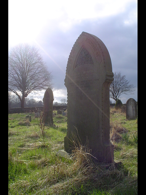
Hey! A non-monotone graveyard shot! And it's done quite well. I love the way it conveys the feeling of death without depression...sort of a peaceful end. You also managed to include the sun quite elegantly. I'm not sure everyone will appreciate this shot, but it's one of my favorites. |
Many thanks! Nice to know some people understood what i was trying to convey |
|
Comments Made During the Challenge  |
|
|
03/09/2004 03:51:38 PM |
|
More contrast would do alot for this photo. Good shot though, might want to try b/w |
|
 Photographer found comment helpful. Photographer found comment helpful. |
|
|
03/08/2004 09:18:26 AM |
|
your composition could be better |
|
|
|
03/07/2004 06:09:11 PM |
|
One of the best out of all the graveyard pictures I've seen. I like the light beam... 8. |
|
|
|
03/07/2004 03:54:10 PM |
|
Hey! A non-monotone graveyard shot! And it's done quite well. I love the way it conveys the feeling of death without depression...sort of a peaceful end. You also managed to include the sun quite elegantly. I'm not sure everyone will appreciate this shot, but it's one of my favorites. |
|
| Photographer found comment helpful. |
|
|
03/07/2004 12:56:44 PM |
|
I like the photo, but not the 2 sided frame |
|
|
|
03/07/2004 09:55:44 AM |
|
The sunlight really kills this photo for me. Maybe a different angle to get it out a little. It's nice, but there is just a bit too much of it... 5 |
|
|
|
03/07/2004 09:09:35 AM |
|
I'm sure you've heard this before, but I don't agree with the vertical bars framing this. The picture itself is great, especially with the colors and the single strand of light. The forboding weather as a contrast to this light is even more interesting. -9- (10 if not for the border, it is after all still part of the presentation.) |
|
| Photographer found comment helpful. |
|
|
03/06/2004 02:45:21 PM |
brightness could have been altered to suit ,black bands distract the eye .
but a good example and creates the mood well????? |
|
| Photographer found comment helpful. |
|
|
03/06/2004 02:22:59 AM |
|
Interesting setup and lighting. I'm not too sure about the dark borders on the sides. |
|
|
|
03/05/2004 03:35:19 PM |
|
Seems to lack contrast, with the sun shining directly into the lens like that. Not to crazy about the partial frame either. |
|
|
|
03/04/2004 07:32:05 PM |
|
| Photographer found comment helpful. |
|
|
03/04/2004 04:28:47 AM |
|
Why the thick lines at the sides? Really nice otherwise. |
|
|
|
03/03/2004 09:28:05 PM |
|
My favorite so far. A 10. I can almost see the lord in this shot ( light on upper left corner ). Nice unkept overgrown grass conveying the theme of this challenge. Excellent. |
|
| Photographer found comment helpful. |
|
|
03/03/2004 01:07:42 PM |
|
|
|
03/03/2004 11:25:43 AM |
|
I like the rays of sun gave it a 9 |
|
| Photographer found comment helpful. |
|
|
03/03/2004 03:34:51 AM |
|
very overexposed! The black borders are distracting. |
|
|
|
03/03/2004 12:29:58 AM |
|
Nice lens flare. I like this. Hope you do well here. |
|
| Photographer found comment helpful. |
Home -
Challenges -
Community -
League -
Photos -
Cameras -
Lenses -
Learn -
Help -
Terms of Use -
Privacy -
Top ^
DPChallenge, and website content and design, Copyright © 2001-2026 Challenging Technologies, LLC.
All digital photo copyrights belong to the photographers and may not be used without permission.
Current Server Time: 06/28/2026 07:51:06 PM EDT.