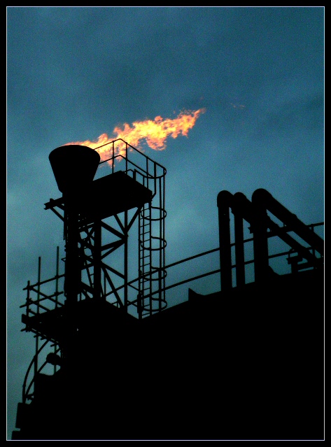
Well, I like it - the graininess, the gloom of it, and I like the way the composition draws everything in to the fire. I don't expect it to do well - none of these dark, sinister, industrial shots seem to.
Statistics
Place: 27 out of 113 Avg (all users): 5.7143 Avg (commenters): 7.7778 Avg (participants): 5.6506 Avg (non-participants): 5.7677 Views since voting: 1279 Votes: 182 Comments: 22 Favorites: 2 (view)
Just want to tell you that this was one of my top three picks for this challenge.
My other two choices finished 1st and 2nd. Sometimes voters miss the mark and I think they did in this case.
The reasons I like it is that it is a good silhouette, the fire itself is not over exposed, it is very well composed and the grainy clouds and overall dark and morose appearance is perfect for an industrial shot. It is high quality. Congrats on a great shot.
This was a 9 from me as it was very similar to the shot I was thinking of submitting.
Unfortunately, people don`t seem to relish industrial shots :(
Great stuff Ed.
Very bold silhouette. Works very well with the frame. The sky color really help to push the colors of the fire forward and makes it pop out of the shot. Abstract, form, colors , little bit of everything. "10"
Very good shot. I would have tried a shot like this for the challenge, but the closest refinery (an hour north of me) closed down a year ago and is now totaly gone (nothing but rubble...)
TC
Good silhouette of the structure, nice composition, the fire is effective as the only 'warm' color in the shot. Some noise in the sky but I dont think it distracts too much.
Excellent image. Very well composed, nice silhouette, the fire is not overexposed and the sky grain included in this image is perfect for this industrial shot. Great job.
very nice composition..I like the black foreground and the grayblue background,both cool colors and the hot flame in contrast. Nice play of straight and curved lines.







 Add photograph to your favorites
 Add photographer to your favorites

 Photographer found comment helpful.


