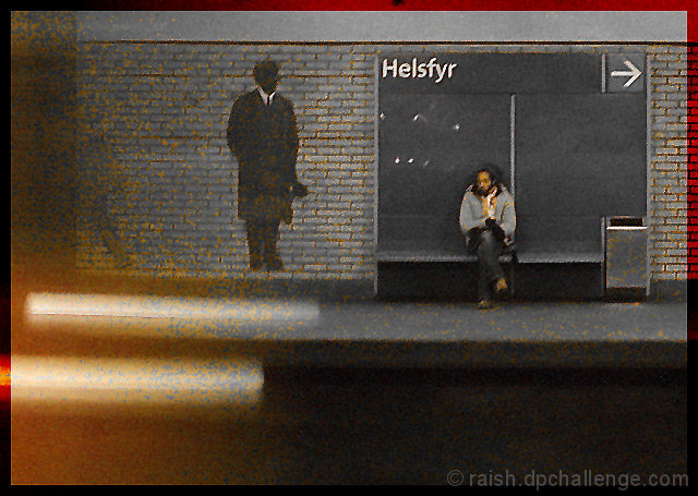
I boldly and somewhat rashly assumed that 'Hell fire and damnation' was a well-known archaic phrase. Here's the original:
I pass through this tube/subway station most weekdays, so all I had to do was get off the train and take some pictures.
I wanted to lose the blue and green on the sign, while keeping the little bit of red from the train that I hadn't cropped out, so I used an adjustment layer with hue/saturation, chose blues or cyan or something in the menu at the top, then moved the little sliders underneath to include all the green and blues shades. I sort of took in most of the yellows as well, but when I moved the saturation slider way over to the left, it left the little remnants that you see in the picture. Looked ok to me :)
Statistics
Place: 52 out of 80 Avg (all users): 5.1179 Avg (commenters): 5.9167 Avg (participants): 5.1471 Avg (non-participants): 5.1124 Views since voting: 955 Views during voting: 362 Votes: 212 Comments: 19 Favorites: 0
This is excellent, Peter! I don't know what you did to get it this way, but it's perfect. I'd say it's an excellent OOBIE candidate but it fits the challenge entirely too well. Well, maybe not for DPC...






 Add photograph to your favorites
 Add photographer to your favorites


 Photographer found comment helpful.


