| Author | Thread |
Comments Made During the Challenge  |
|
|
09/29/2002 09:38:00 PM |
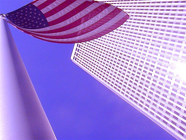
Initial=nice angle
Composition=done well
Clarity (focus, details)=good
Exposure=good
Interesting or Emotive=both
I am using a this new detailed commenting method inspired by autool. (Thanks
autool!). I hope you find it more helpful than my former comments.
Thanks for submitting, and good luck! ;0)
kpb
|
|
|
|
09/29/2002 08:15:00 AM |
|
The glare on the right is a bit distracting but I still like this photo. |
|
|
|
09/27/2002 10:59:00 PM |
|
very very nice--this framing is superb |
|
|
|
09/27/2002 06:38:00 PM |
|
very creative...great perspective |
|
|
|
09/27/2002 04:54:00 PM |
|
nice perspective with the pole |
|
|
|
09/27/2002 03:58:00 PM |
|
I like the perspective. Sky is mighty blue in this shot. Good job |
|
|
|
09/27/2002 01:59:00 PM |
|
The reflection on the tower is really hard on the eyes, but the idea is good. |
|
|
|
09/27/2002 01:05:00 PM |
|
this is a neat image... i love the concept... There seems to be a heavy 'blue' cast.. almost like this was taken with the white balance set on the 'indoor' mode maybe... i like the photo overall though... good work :) - setzler |
|
|
|
09/26/2002 06:16:00 PM |
|
Has a bit of a pinkish cast to it... otherwise, good eye! |
|
|
|
09/26/2002 01:34:00 PM |
|
Really neat angle. I just so tired of the "Go America!" patriotic stuff. |
|
|
|
09/26/2002 09:26:00 AM |
Composition: Subject Placement, Cropping, Background7,
Technical: Focus, Exposure, Lighting, Processing7,
Appeal: Is it Interesting, Motivating, Etc.? 6,
Total Averaged Rating7. Autool
|
|
|
|
09/26/2002 04:11:00 AM |
|
Great angles here, and positioning of the flag. Great colors too! |
|
|
|
09/26/2002 02:00:00 AM |
|
but I feel like I am about to fall over. |
|
|
|
09/25/2002 04:38:00 PM |
|
Like the composition A LOT. Quality of image is very low. Oversharpened? Don't like the title at all. 6 chakkobbo |
|
|
|
09/24/2002 09:27:00 PM |
|
|
|
09/24/2002 09:01:00 PM |
|
Definitely a unique composition! Seems like there's a bit of a bluish tint that could have been edited away a bit, but it's still an interesting, unique shot. |
|
|
|
09/24/2002 07:39:00 PM |
|
|
|
09/24/2002 02:46:00 PM |
|
like the picture, but not the picturename... |
|
|
|
09/24/2002 08:11:00 AM |
|
hm... kind of pics i like ... |
|
|
|
09/23/2002 08:47:00 PM |
|
|
|
09/23/2002 08:37:00 PM |
|
I like the angle and the corner for the challenge. |
|
|
|
09/23/2002 06:41:00 PM |
very nice. something happend with the whites, though. check your camera's white balance maybe you can re-shot it, 'cause it's a good one.
|
|
|
|
09/23/2002 05:09:00 PM |
|
This has a pink cast, was that intentional? Nice tribute. Good luck. Justine |
|
|
|
09/23/2002 04:53:00 PM |
|
good angle. I don't like that glare on the right though. |
|
|
|
09/23/2002 07:09:00 AM |
|
The corner reflection is a little hard on the eyes, but still a great image. |
|
|
|
09/23/2002 01:43:00 AM |
|
If it were possible to lose the blowout on the right edge, I'd probably score a 9 for this gloriously weird perspective view. But the blowout really bothers me. 7 Jak |
|
|
|
09/23/2002 01:13:00 AM |
|
Nice perspective, but a bit heavy on the bluish tones. |
|
Home -
Challenges -
Community -
League -
Photos -
Cameras -
Lenses -
Learn -
Help -
Terms of Use -
Privacy -
Top ^
DPChallenge, and website content and design, Copyright © 2001-2026 Challenging Technologies, LLC.
All digital photo copyrights belong to the photographers and may not be used without permission.
Current Server Time: 06/29/2026 12:49:26 AM EDT.