| Author | Thread |
Comments Made During the Challenge  |
|
|
03/02/2004 10:52:34 PM |
|
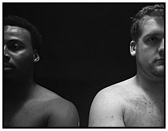
so, assuming that the title has something to do with the photo, I would guess these men are not boxers, unless boxing has become a sin... are they lovers, lined up to enter confessional? Are they two sides of St Augustine, the caucasian being a minor sin, the black a more serious sin? (Hmmm, sin is who I am...) I give up. 7. because I had to think about it. |
|
|
|
02/29/2004 10:31:05 PM |
|
Interesting shot and composition. It doesn't convey the message of conflict by itself. |
|
|
|
02/27/2004 02:56:33 PM |
|
Very well done...seems a little blurry...not sure if it was intended...but I do like the conflict involved in this photo...keep em coming. |
|
|
|
02/26/2004 11:58:14 PM |
|
|
|
02/26/2004 08:23:58 PM |
|
Interesting composition, but the men are both out of focus. I'm really not sure what kind of conflict you are getting at here--black vs. white? Then what does the title have to do with anything? Confusing. 4 |
|
|
|
02/26/2004 09:59:39 AM |
|
I like this photo. I think it could be improved with just a bit more light and maybe a neutral background, but I like the idea a lot. |
|
|
|
02/26/2004 07:17:27 AM |
|
excellent idea here - the height difference, while demonstrating one point breaks the symetry of the composition (hairy chest does as well) - I do like the title. |
|
|
|
02/25/2004 11:39:30 PM |
|
|
|
02/25/2004 11:35:10 PM |
|
|
|
02/25/2004 06:13:02 PM |
|
|
|
02/25/2004 04:58:01 PM |
|
The guy on the right has a slightly blurred forehead, other than that very crisp, great use of shadows & cropping |
|
|
|
02/25/2004 02:23:15 PM |
|
i see black and white type of conflict here. |
|
|
|
02/25/2004 04:27:08 AM |
|
Nicely cropped but focus should be better. |
|
|
|
02/25/2004 02:29:01 AM |
|
This is a really interesting and compelling composition; I like the crop lines. Seems a tad out of focus though. |
|
Home -
Challenges -
Community -
League -
Photos -
Cameras -
Lenses -
Learn -
Help -
Terms of Use -
Privacy -
Top ^
DPChallenge, and website content and design, Copyright © 2001-2026 Challenging Technologies, LLC.
All digital photo copyrights belong to the photographers and may not be used without permission.
Current Server Time: 07/01/2026 07:53:18 PM EDT.