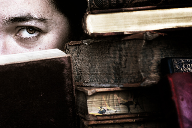
books are, of course, an extension of the self. this is a duotoned image and a full colour one combined (the same exposure) to get the richness of the books' colours and yet tone down the skin tones.
Statistics
Place: 54 out of 241 Avg (all users): 6.2057 Avg (commenters): 7.4815 Avg (participants): 6.0488 Avg (non-participants): 6.3057 Views since voting: 1374 Views during voting: 445 Votes: 316 Comments: 39 Favorites: 2 (view)
Love how there are two concepts represented here: books being an extension of who a person is and that the eye(s) are windows to the soul. Nice earthy tones - some great textures on the books that add character and dimension.
I liked this shot, but kind of missed the self-portrait connection (my problem, not yours). Aside from being a self-portrait, though, it's a very interesting image. What I so appreciate about you, Christian, is your pursuit of your own artistic style.
As usual, I love the processing work that you do in your photos. They all have this earthy feel to them. I love the brownish tones. Your face really blends in well with the books with enough highlights to pull one's attention in that direction. Great photo!
One more comment then I promise I'll stop... I noticed when looking at your profile page that your eye in this shot very well matches your sprog's eyes in "Riley Bites". Kinda cool!
Christian, I have to say that for me this was perhaps the most underated photo in the challenge. Wonderfully creative and composed (as I mentioned in my earlier posting) and deserving of a far higher score
i love this shot.
The old books texture and tone is great and just one eye makes spooky and that i love it.
Front DOF is nicely done but i think IF all picture was focus... for me that will be kind of 1 scene of move and i will love that even more.
anyway... well done! this is Great shot!
Excellent! So glad this was you! After I voted I kinda wondered if it was, but you look very different to me in a lot of your pics, so I wasn't sure. The portait does fit you very well. And the two I had tied for my top spot ended up being two of my fav photogs, and right next to each other in results, too. Kinda nifty!
Really like the duo combined with the color. I'll have to try that - I often overlay a B&W and fade it back. It does add a toned downed richness if that makes sense.
I wish we could see just a bit more of 'you'. You have a nice photo here, just not enough portrait. This is just my opinion, take my comment with a grain of salt! BB
Its a nice photo because it tells a story about you. Its really pushing the idea of a self portrait to by adding a little bit of you in it, which is your eye. Which is really a special part of the body cause its through our eyes that we can make out what the world is, so would that make our eyes, who we are?
I don't know, but good use of putting yourself in the frame somewhere and having yourself stick out because of it. I just am not a big fan of the over-sharpening. Mainly because of my own reasons, but it is a good photo.
Normally I am not scoring high on such small parts of one's self, but this one is different. This one seems to speak to me for some reason. I don't know what it says, but I like it. :D
What a brilliant SP!!!! Love the composition and the fact that although the viewer can only see one eye it is that which dominates the farme. Great focus and textures on the book as well which mean they compliment the shot rather than simply feeling like a prop. Bump to 9
I love this picture and I want to vote it high for the overall setup...but I don't know if I could classify this as a Self Portrait...so I'm just going to leave a comment and not vote on this one just in case I'm wrong.





 Add photograph to your favorites
 Add photographer to your favorites

 Photographer found comment helpful.


