| Author | Thread |
Comments Made During the Challenge  |
|
|
02/29/2004 07:03:41 PM |
|
|
|
02/28/2004 08:24:47 PM |
|
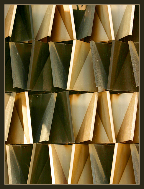
Interesting abstract, well seen. I'm a tiny bit distracted by the somewhat uneven lighting, but I'm a big fan of graphic abstract images and like this very much. |
|
 Photographer found comment helpful. Photographer found comment helpful. |
|
|
02/28/2004 03:19:39 PM |
|
like the abstractness, repeated patterns and colors...like the small lighter frame and my only nit is the black frame is, IMHO, just too wide. Other than that, super! |
|
| Photographer found comment helpful. |
|
|
02/28/2004 02:42:16 PM |
|
Very artsy. Can't tell what it is w/o title. |
|
|
|
02/27/2004 04:09:33 PM |
|
|
|
02/26/2004 11:40:24 PM |
|
Very interesting idea and shot. Nice rhythm and textures. |
|
| Photographer found comment helpful. |
|
|
02/23/2004 06:51:50 PM |
|
Great shot - very artsy indeed. I like the simplicity of it. |
|
| Photographer found comment helpful. |
|
|
02/23/2004 03:19:20 PM |
|
What a great abstract! Title helps tie it to the theme. I really wanted not to see the plug-looking thing top center - it's the only flaw here. |
|
| Photographer found comment helpful. |
|
|
02/23/2004 03:30:33 AM |
|
I think this would be a lot tighter if the gap or shadow in the middle of the top edge weren't there... it's a distracting little detail in an otherwise regular field. |
|
| Photographer found comment helpful. |
Home -
Challenges -
Community -
League -
Photos -
Cameras -
Lenses -
Learn -
Help -
Terms of Use -
Privacy -
Top ^
DPChallenge, and website content and design, Copyright © 2001-2026 Challenging Technologies, LLC.
All digital photo copyrights belong to the photographers and may not be used without permission.
Current Server Time: 06/28/2026 01:21:44 PM EDT.