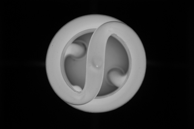
I'm not a great photographer, so take my comments for what they're worth to you. While this light bulb would make an excellent abstract, the dead center position defeats the purpose. An off center or possibly square crop would work better. Also, I think it would looked better if you had used some color in your toning.
Nice and simple and composed dead in the centre which is not often advised (rule of thirds) but it works here. Its just a shame its not a lot sharper and with a lot more contrast; the brightest point in the image could be stretched out quite a bit using curves or levels in PS to make it more dramatic and cover the hole duotone range
Good idea, to make an image right from on top of a compact fluorescent. On my monitor, it looks slightly soft. I think it needs something else to "sell" the image (at DPC or elsewhere). It's neat, but by itself it's sort of bland.





 Add photograph to your favorites
 Add photographer to your favorites


 Photographer found comment helpful.


