| Author | Thread |
Comments Made During the Challenge  |
|
|
02/24/2004 09:39:11 PM |
|
|
|
02/24/2004 04:33:52 PM |
|
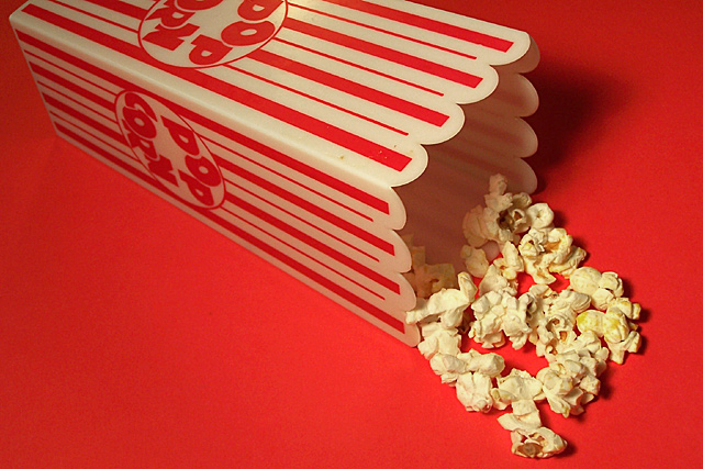
Closer to the popcorn please! I need to feel it! |
|
|
|
02/23/2004 11:31:13 PM |
|
Nicely done with well chosen backdrop; main issue is that you aren't really close enough to see texture of the popcorn, though most of us know it well. I think a macro of the corn would have been a good idea, though this is a solid pic! One other thing: what happened to the rest of the popcorn.... hmmm, going to make some now. |
|
|
|
02/22/2004 04:23:16 PM |
|
the red background bit too much maybe closer zoom on popcorn would help, or different light. |
|
|
|
02/20/2004 02:59:02 PM |
Decent composition, but it looks flat due to unimaginative lighting. Bring in some light from the side and your popcorn might pop!
TC |
|
 Photographer found comment helpful. Photographer found comment helpful. |
|
|
02/20/2004 01:55:35 PM |
|
Clean composition, good sense of the smoothness of the container, and the brittleness of the popcorn. colouring of background complememts the box well too. Not somethging to really grab my eye though, despite the good lighting. |
|
| Photographer found comment helpful. |
|
|
02/20/2004 10:44:16 AM |
|
I really like your composition on this one. It's cute and a nice take on the Challenge. The popcorn (what remains of it!!) could have been a bit crisper, but overall, it is good. |
|
| Photographer found comment helpful. |
|
|
02/19/2004 07:02:48 PM |
|
Effective use of colors. Nice sharp focus on the popcorn. Well done. |
|
| Photographer found comment helpful. |
|
|
02/19/2004 05:16:07 PM |
|
a little light coming from the right side would help fill in the shadowed areas. |
|
| Photographer found comment helpful. |
|
|
02/19/2004 04:51:45 PM |
|
I think if you had included less box and more popcorn it would have been more effective. The red background is cool. How'd you do that? |
|
| Photographer found comment helpful. |
|
|
02/19/2004 03:43:07 PM |
I think if you had put the popcorn in a bowl, put some butter on them and taken a close up of the popcorn - it would have created a better texture effect.
|
|
| Photographer found comment helpful. |
|
|
02/19/2004 05:10:14 AM |
|
lovely pure red bg, would crop an inch from left though so the box fills the frame. |
|
| Photographer found comment helpful. |
|
|
02/18/2004 09:13:03 PM |
|
Nice compositon, colors and light. |
|
| Photographer found comment helpful. |
|
|
02/18/2004 08:45:37 PM |
|
Unfortunately you ate most of it! I feel (personal taste. . . no pun intended) that it would have bee more dramatic if there had been a volume of pop corn pouring out of the box filling the frame with more texture. |
|
| Photographer found comment helpful. |
|
|
02/18/2004 11:00:16 AM |
|
Simple idea, well shot I think. Good texture and focus. Good colors and lighting. |
|
| Photographer found comment helpful. |
Home -
Challenges -
Community -
League -
Photos -
Cameras -
Lenses -
Learn -
Help -
Terms of Use -
Privacy -
Top ^
DPChallenge, and website content and design, Copyright © 2001-2026 Challenging Technologies, LLC.
All digital photo copyrights belong to the photographers and may not be used without permission.
Current Server Time: 06/28/2026 09:43:31 PM EDT.