| Author | Thread |
|
|
10/29/2007 10:57:37 PM |
|
Very cool. Would like to see this one further up on the voting scale!! |
|
 Photographer found comment helpful. Photographer found comment helpful. |
|
|
10/29/2007 12:59:19 PM |
|
One of the best in this challenge for me!! |
|
| Photographer found comment helpful. |
Comments Made During the Challenge  |
|
|
10/28/2007 11:27:51 PM |
|
Very nice idea and execution. Simple and clean, I can't think of anythign to really make this stronger. Good luck with this one! |
|
| Photographer found comment helpful. |
|
|
10/28/2007 09:32:09 PM |
|
| Photographer found comment helpful. |
|
|
10/28/2007 06:22:00 PM |
|
cleaver idea and nice simple composition. |
|
| Photographer found comment helpful. |
|
|
10/27/2007 09:14:44 PM |
|
oh this is neat! I like it |
|
| Photographer found comment helpful. |
|
|
10/27/2007 10:57:21 AM |
|
| Photographer found comment helpful. |
|
|
10/27/2007 01:56:51 AM |
|
Great slant on the challenge - you did a good job on photographing your concept as well. |
|
| Photographer found comment helpful. |
|
|
10/26/2007 04:40:11 PM |
|
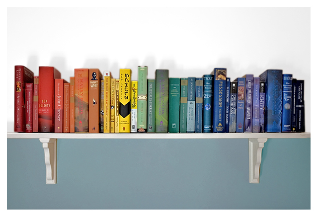
I voted an 8 on this a couple of days ago, but now that I'm back to comment, this really deserves better. I typically don't like dividing photos in the center like this, but because the wall is a different color top/bottom, it really works well. Of course the idea is totally awesome and now I can't get the Reading Rainbow song out of my head! bumping to 10 and my blue :) |
|
| Photographer found comment helpful. |
|
|
10/26/2007 01:25:31 PM |
|
Good Idea, very creative. |
|
| Photographer found comment helpful. |
|
|
10/25/2007 10:33:19 PM |
|
Good idea.. nice tonal composition .. |
|
| Photographer found comment helpful. |
|
|
10/25/2007 09:55:53 PM |
|
A nice interpretation of the subject. I like the subtle shadow and the border complements it well. |
|
| Photographer found comment helpful. |
|
|
10/25/2007 03:07:33 PM |
|
Cute idea! You've got me thinking about reorganizing my bookshelf now :-) |
|
| Photographer found comment helpful. |
|
|
10/25/2007 12:00:51 PM |
|
Nice. Couple of things to bear in mind - the shadows above the books are not especially attractive and in general this lacks a little bit of sharpness. |
|
| Photographer found comment helpful. |
|
|
10/25/2007 07:50:49 AM |
|
The idea is a good one, but needs a little more attention to pull it off entirely successfully. Personally, I would prefer to see more negative space to the top of the frame and a rather tighter framing to the sides, so that the ends of the shelf aren't visible. the shadows are somewhat distracting, but I can't give you any practical advice here, as I am a complete ingnoramous as far as artificial lighting goes. |
|
| Photographer found comment helpful. |
|
|
10/24/2007 10:00:51 PM |
|
| Photographer found comment helpful. |
|
|
10/23/2007 11:52:36 PM |
|
| Photographer found comment helpful. |
|
|
10/23/2007 11:23:30 PM |
|
Only 3 Harry Potter books? |
|
| Photographer found comment helpful. |
|
|
10/23/2007 09:41:53 PM |
|
such a great idea - love the theme, love the composition, love the color set up. the only thing that is on the down side for this is the lighting - the shadows above the books really distract and cost it a point or two from me |
|
| Photographer found comment helpful. |
|
|
10/22/2007 07:59:39 PM |
|
Hey, this is cool - a "novel" idea :-D I like the composition and lighting. If anything, I wish the shadows behind the books were either stronger or not there altogether. |
|
| Photographer found comment helpful. |
|
|
10/22/2007 05:23:23 PM |
|
funky shadows above the books, the angle gives them a weird 2D look too... but overall, a cool idea... especially like the Schultz book! :) |
|
| Photographer found comment helpful. |
|
|
10/22/2007 05:20:18 PM |
|
Really clever take on the challenge well done. |
|
| Photographer found comment helpful. |
|
|
10/22/2007 07:08:29 AM |
|
nice idea! have the feeling, the image was tilted to the right (though it isn't really). light is a bit too harsh. |
|
| Photographer found comment helpful. |
|
|
10/22/2007 03:59:18 AM |
|
-Fantastic- idea, very well executed; the only thing missing is LaVar Burton :) |
|
| Photographer found comment helpful. |
Home -
Challenges -
Community -
League -
Photos -
Cameras -
Lenses -
Learn -
Help -
Terms of Use -
Privacy -
Top ^
DPChallenge, and website content and design, Copyright © 2001-2026 Challenging Technologies, LLC.
All digital photo copyrights belong to the photographers and may not be used without permission.
Current Server Time: 06/27/2026 01:31:45 PM EDT.