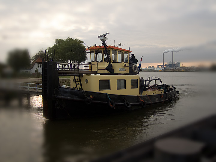
A ship near my daily ferry. Tried different edits, but (running out of time) just came up with almost the same editing I did yesterday. Although not very clear, Argo is the name of this ship.
I love the light and colors in this. Not at all sure you needed so much blur (your composition is quite good), but it does bring the eye to the center.
The boat is a good photo subject. I like the colors especially. I agree with those who feel the vignette is too strong, but there is nothing wrong with taking chances, especially here in these side-challenges, so keep experimenting!
I like the overall picture. I'm not sure I like the softness around the edges. It made me think something was wrong with my eyes. If you could "graduate" it towards the middle so that it wasn't so abruptly blurry where it starts, it might be more effective. Sorry if that doesn't make sense.
I like the vignette you choose to use, it really emphasizes the ship. Good composition with the industry in the background to add to the picture but not over power it.
I like this alot. The blur enhances the feel of the photo, and I love the color tones. I think Muckpond is on to something with maybe making the blur fade into the focused part a little more gradually, but it really catches your eye as soon as it pops up on your screen!




 Add photograph to your favorites
 Add photographer to your favorites


 Photographer found comment helpful.


