|
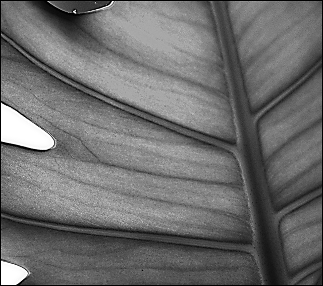
I like this for several reasons, first and foremost because of the great lines. I also like the tonal quality of the viens and leaf. However, the blown white background is too distracting and creates an inbalance in the otherwise calm composition (and the negative space on the top left too). If it could be cropped tighter without loosing to much quality (although it looks like you have gone about as far as you can) it would have helped imho. Also shooting a little up from wide open might have given you a little better depth to work with. I Like it though for the graphic feeling as you say. Well done overall! |





 Add photograph to your favorites
 Add photographer to your favorites


 Photographer found comment helpful.


