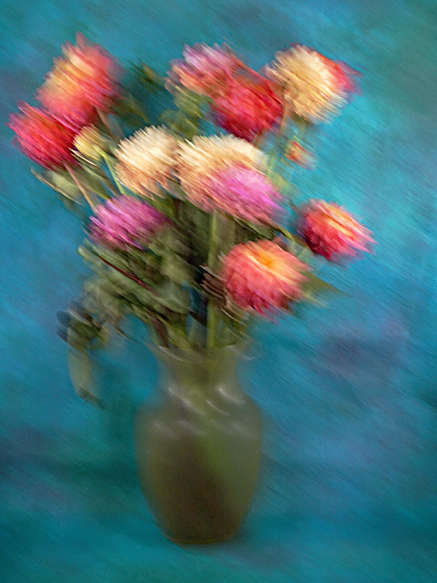
After Van Gogh. That is what I was going for. I think I was only moderately successful. The brush strucks are not so Van Gogh. They were achieved in the shooting, f/ 22 at 1/10 second with angled left top to bottom right movement of the camera.The strokes were accentuated in processing by a good healthy dose of USM.
I shot this twice and processed two versions of an image with just the flowers. Ending up shooting the second time to get the vase in the shot without it being at the absolute bottom of the frame. Aiding the brush stokes for the Dahlias was there less than pristine condition. I bought them last Saturday. I think if they were bright and healthy I might not have gotten as good a stroke effect. The background is a piece of hand painted paper from Thailand that I bought in art store in town. It is the back of the paper as the front has great globs of golden paint all over it along with a lot of black swirls. Very distracting. The back is just color and works well for impressionism, I think. Hope you do as well.
Post: Convert from raw in PSElements 3.0 with a +1.0 exposure compensation. The dust at F/22 is revelatory, so I worked that out first mainly with the healing brush and some cloning. Two crops, up from the bottom and then in from the right to compensate. Layer adjustments for levels, brightness/contrast and hue/saturation. Layer of curves adjustment. Toyed with several blending modes but ended up with normal. NeatImage. Dodge and burned areas of the background. Also some minor cloning to lose a crease in the paper. More dust eradication. USM: 70%, 10 pixels, 0 threshold. Another layer of hue/saturation to desaturate slightly. I reviewed some of Van Gogh's paintings and so that he really filled the frame with his subject so I cropped again. Also added back the saturation. Resize. Sharpen.
Statistics
Place: 113 out of 206 Avg (all users): 5.1286 Avg (commenters): 6.0000 Avg (participants): 5.0000 Avg (non-participants): 5.3103 Views since voting: 847 Views during voting: 237 Votes: 140 Comments: 6 Favorites: 0
I think that your interpretation of impressionism is nice. I like the colors. I think I would have liked more to it...another component in the image...maybe, a table. Just a thought.
Just a tad too much movement! The background is amazing, is it painted or, what is it? I know everyone is scared to center an object these days but I would like this a bit more centered as well.





 Add photograph to your favorites
 Add photographer to your favorites


 Photographer found comment helpful.


