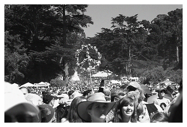
With all the tie dye and other colors floating around at the Summer of Love, B+W just doesn't do it justice ... but I'm in the challenge, so did a quick conversion on one for Day 3.
Levels, converted to b+w, added some noise and scratches to try to give it an old time feel, but not strong enough to have much effect imo
I think the colors may detract from all the details that you wouldn't notice otherwise. While I'm sure it is great in color as well, I think you get a better sense of the "massiveness" of the people in this shot. In color, I think it might just look busy.
Dennis, you got some great candid shots, and you're right - b&w doesn't do them justice. However, I like this shot in B&W. It gives it a documentary feeling which you wouldn't achieve with color - it would be more snapshot-ish. Also in B&W those beautiful cypress trees aren't so overwhelming, but create a wonderful backdrop.






 Add photograph to your favorites
 Add photographer to your favorites


 Photographer found comment helpful.


