| Author | Thread |
Comments Made During the Challenge  |
|
|
09/09/2007 11:27:57 PM |
|
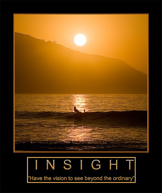
Beautiful image. The slogan is nice, and works well with your image. Nice colors as well. |
|
|
|
09/09/2007 02:51:42 AM |
|
Extraordinary photo, nice poster. |
|
|
|
09/06/2007 02:53:11 PM |
|
Nice photo, love the colour, hate the box you put around your text. |
|
|
|
09/06/2007 02:45:55 PM |
|
Presentation is very nice. The left alignment of 'insight' and 'have the vision to see beyond the ordinary' is a little distracting. I love the picture. |
|
|
|
09/06/2007 07:42:02 AM |
|
Great picture, fonts are a bit off though. They would have looked better solid and without the box/border around them |
|
|
|
09/04/2007 11:58:37 PM |
|
Very Nice. One of my high voted entries. |
|
|
|
09/04/2007 09:24:12 AM |
|
beautiful image...the text looks a little squeezy in that box |
|
|
|
09/03/2007 08:51:21 PM |
|
Beautiful emotive image! The border around the quote is gilding the lily though, in my opinion :) |
|
|
|
09/03/2007 07:13:10 PM |
|
Great picture! Not sure if the boarder around the text is nessesary. |
|
|
|
09/03/2007 12:32:52 PM |
|
Beautiful shot and wise words - but I would have liked the presentation a lot better without the framing around the words. |
|
|
|
09/03/2007 04:15:28 AM |
|
photo is nice but a tad oversharpened. frame around image is too playful. frame around the text is too tight and unnecessary. Typeface of quote is too ordinary and cold, doesn't match the message of the poster. |
|
|
|
09/03/2007 03:26:59 AM |
|
|
|
09/03/2007 02:18:52 AM |
|
Beautiful shot!...Nicely Done. 8 |
|
|
|
09/03/2007 12:51:58 AM |
|
Ooh, a great shot done in by a bad font, a bad frame around the text, and superfluous quotation marks. It really is a nice shot, though. |
|
Home -
Challenges -
Community -
League -
Photos -
Cameras -
Lenses -
Learn -
Help -
Terms of Use -
Privacy -
Top ^
DPChallenge, and website content and design, Copyright © 2001-2026 Challenging Technologies, LLC.
All digital photo copyrights belong to the photographers and may not be used without permission.
Current Server Time: 06/29/2026 08:23:36 AM EDT.