| Author | Thread |
|
|
09/14/2007 01:47:50 AM |
|
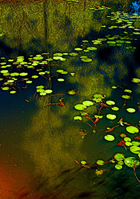
brilliant .. i love how this gives me a feeling of tranquility & the way you have the bright blue and the red areas balancing each other at opposite corners .. great composition and impressionist feel .. :) |
|
 Photographer found comment helpful. Photographer found comment helpful. |
Comments Made During the Challenge  |
|
|
09/13/2007 01:07:35 PM |
|
Upper 4/5th is very nice but red at left bottom is somewhat distracting. Would suggesting cropping out lower 1/5. |
|
| Photographer found comment helpful. |
|
|
09/11/2007 09:41:45 PM |
|
pretty reflections but color seems over saturated here without a lot of textures |
|
| Photographer found comment helpful. |
|
|
09/08/2007 10:58:02 PM |
|
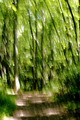
Looks to be more expressionism than impressionism. But that is only my opinion. I do think if this were a Van Gogh challenge and you cropped it at the half way point and threw away the now lower half you would win a bright blue ribbon. |
|
| Photographer found comment helpful. |
|
|
09/07/2007 10:31:01 PM |
|
Let me be the first to congratulate you on you ribbon! |
|
| Photographer found comment helpful. |
Home -
Challenges -
Community -
League -
Photos -
Cameras -
Lenses -
Learn -
Help -
Terms of Use -
Privacy -
Top ^
DPChallenge, and website content and design, Copyright © 2001-2026 Challenging Technologies, LLC.
All digital photo copyrights belong to the photographers and may not be used without permission.
Current Server Time: 07/16/2026 06:12:48 AM EDT.