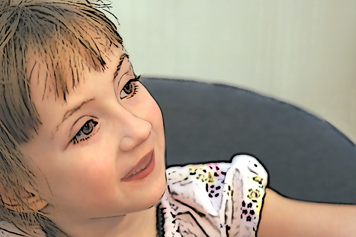
Anya and her little sister Mya are my two photographic God-daughters. I have standing orders from there mother to shoot at will. Anya loves having her picture taken, well most of the time. Anyway, I caught her at the reception after church on Sunday for our departing interim rector.
Post: Convert from raw in PSElements 3.0 with a +0.67 exposure compensation. Layer adjustments for levels, brightness/contrast and hue/saturation. Merge visible. NeatImage. Dodge face, very blotchy. Clone out dark patch
on wall mid right center above seat. Sharpen. Duplicate background twice. Middle Layer Photocopy filter. White brush to eradicate dark blotches on face, neck, arm and background. Top layer used Buzz simplifier No. 1. Change Blending mode to Multiply and opacity to 75%. Back to middle layer to clean up more smaller blotches and to thin the accent lines on her face neck. Spot healing some more blotches. Messed with the blending modes and opacity of all layers and went with aforementioned. More thinning of accent lines on face. Merged layers down. The mouth did not look quite right as I think it moved during the shooting. Spot editing with clone, Smudge tool and pencil tool to get a bit more natural looking. The lips were very bright red so I used the Sponge tool to desat them a bit. Some burning under the lower lip and more cloning on the mouth. Finally got the mouth in a manner that I liked. Sharpened. Resize. Sharpen.
Statistics
Place: 494 out of 503 Avg (all users): 4.1517 Avg (commenters): 4.0000 Avg (participants): 4.0485 Avg (non-participants): 4.4048 Views since voting: 939 Views during voting: 215 Votes: 145 Comments: 13 Favorites: 0
Your comment, below, leads me to believe that you do not understand why this submission did not fair better in the challenge. Here is my take:
First off, what is immediately noticed is that the harshness of the black lines really contrasts with the softness of the subject - which on its own is an interesting effect for the sake of noting different effects.
The effect on this photo, however, strongly pulls the viewer away from the concept of photography and into the realm of digital art (similar to - but to a much greater degree - than the two photos you have posted in your response, below) due to the fact that the subject is a portrait of a child. The fact that the chosen subject is emblematic of purity and innocence causes the contrast set up in the post-processing effect to be amplified to the point where the mind has difficulty merging the ideas of "child" with this unusual and stark technique. Metaphorically, you are asking the viewer to swallow sugar with equal amounts of salt.
I think this post processing technique would be more easily accepted on architecture or still life.
Hi Robert. Well, I guess you got a clear indication of how DPC views photographs turned into illustrations. It's a pretty shot, anyway. I bet it'd do well in a digital art contest. :)
Sorry, this is not to my taste at all, I want images that appear photographic and don´t look like Illustrator drawings, just wanted to explain why I voted this a 3.




 Add photograph to your favorites
 Add photographer to your favorites


 Photographer found comment helpful.


