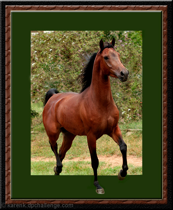
Yeah, sure is but I am actually not really liking that part of the photo, I think the choice of green in the frame is what kills it, had you selected white it just would have looked cleaner and more realistic.
Love the idea, but stepping out to what?...A beautifl horse, really stunning. But this beautiful power steps into a ( for my taste) boring frame. The likes look like cutted out. I do not know how to improve this but it look a bit funny.
well... i'm personally not fond of the frame or the green in it and i think it is cropped to closely. also, i hate to keep nit-picking, but the horse seems to be leaning unnaturally to the left. otherwise i think this is a beautiful subject with good lighting.
Nice attempt at out-of-bounds editing. A leg shadow in the green area would have helped the 3D effect. You could have also had the head on the outside of the frame...






 Add photograph to your favorites
 Add photographer to your favorites


 Photographer found comment helpful.


