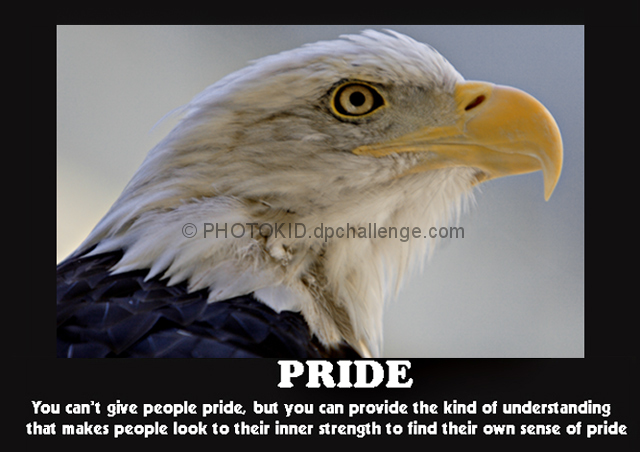
from the thumbnail it looks interesting picture, so this is good point about it. However when it opened, viewer (at least me) loses interest in it. Why , because I can not find a place where i could see you might have focused. all image look soft. If it were little bit more sharper, it might have scored little better. You could try sharpening it and see yourself how it looks. I will download it and see it myself though.
The technicals: The first thing that jumps out to me is the lack of true whites. This either indicates underexposure, or a color cast. I think increasing the contrast could have helped somewhat. A bit more saturation could have made that beak pop a bit too. Composition is a nice tight crop.
The feel: Has a decent feel for a patriotic eagle shot.
The game: I think the quote is a bit wordy. That has nothing to do with photography though. Did you resize after you placed the text? If so, that's the culprit for your soft letters. Never resize text if it can be helped.







 Add photograph to your favorites
 Add photographer to your favorites

 Photographer found comment helpful.


