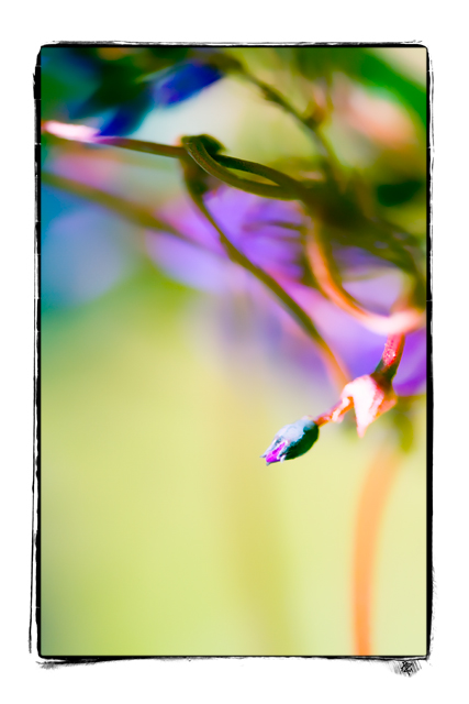
Really stunning!!!! The vivid colors work because there is such a nice amount of negative space in a paler color to subdue it and make it all work together.
I like this composition, how it gradually moves from "busy" to simple, top to bottom. But I don't like as much the ultra-bright portion just behind the bud on the right side of the frame, it's an area of harshness in an otherwise soft image.





 Add photograph to your favorites
 Add photographer to your favorites

 Photographer found comment helpful.


