| Author | Thread |
|
|
08/25/2007 01:19:33 PM |
Please take the following as it is intended, as constructive criticism. I'm afraid that my first impressions are:
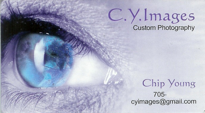
too much detail in the lashes and the skin - we are more used to softer tones and shallower DOF for theseds of shots. This does not end up looking glamorous as a consequence.
The globe in eye thing I thought was a printing mistake. It needs to be more obvious, or got rid of: the eye is enough by itself.
I'm not a huge fan of the colour scheme or the font - but that is a very personal thing. |
|
 Photographer found comment helpful. Photographer found comment helpful. |
|
|
08/24/2007 07:41:13 PM |
My only comment would be that I think your name is more important than a "company" name. Photographers generally work as individuals and I think clients tend to remember names more than companies. If one was in banking, that would be a different matter.
I'd say:
Chip Young
Photography
Portfolio: www.chipyoungimages.com
email: ching@chip......com
That is more important than the art which can easily be switched out. 0.02 cents worth next to nothing at USD exchange rate on world markets. |
|
| Photographer found comment helpful. |
|
|
08/24/2007 06:44:27 PM |
|
compositionally, i think the eye needs to be looking into the card, rather than out of the "frame". it draws a viewer's eye into the same direction. this is just my personal opinion, although i believe the name and such need to be a bit bigger, and the purple a bit darker. the globe in the iris throws me off too. it could be a part of your scan that causes the quality to deteriorate, but i'm not sure i like it, even compensating for that. hope this helps! |
|
| Photographer found comment helpful. |
|
|
08/24/2007 02:25:36 PM |
Business cards sure are hard to design. In this case, I think the font and contact information work fairly well - elegant and stylish. But having a large close up of an eye would work better if it could be instantly grasped as a beautiful eye.
Unfortunately, the reflection of a globe produces blotches, highlights, and straight lines that make the eye look very wrong - blurry at best. Upon opening the image, my first impression was that the eye is most likely diseased -- the opposite of attractive or desirable. Even with your explanation, the globe takes a fair amount of work to perceive. The idea of substituting a "world" image into an eye might be worth futher attempts (clever idea), but I suspect that even a crisp version would clash with what we expect to see in an eye and would be a serious subliminal negative.
At the thumbnail level, I thought this might be a card you developed for an optical shop (the word "Images" easy to see, large eye easy to detect). It made me expect a contact lens promotion. Others may see it differently. You might want to look at your next versions from a couple of arm lengths away to see what a casual observer might detect at first glance.
Message edited by author 2007-08-24 14:53:19. |
|
| Photographer found comment helpful. |
|
|
08/24/2007 01:55:57 PM |
Originally posted by drydoc:
I like the concept. The font needs to be bold . . . especially your name. But I am not so sure I like the style of font. It does not seem to compliment the image. The marbled (artsy) iris does not match up with the more focused eye lids. Sorry for being so blunt. |
I thought so too at first but if you look at it closely,I think it's the reflection of a globe |
|
|
|
08/23/2007 09:39:55 PM |
|
I like the concept. The font needs to be bold . . . especially your name. But I am not so sure I like the style of font. It does not seem to compliment the image. The marbled (artsy) iris does not match up with the more focused eye lids. Sorry for being so blunt. |
|
| Photographer found comment helpful. |
Home -
Challenges -
Community -
League -
Photos -
Cameras -
Lenses -
Learn -
Help -
Terms of Use -
Privacy -
Top ^
DPChallenge, and website content and design, Copyright © 2001-2026 Challenging Technologies, LLC.
All digital photo copyrights belong to the photographers and may not be used without permission.
Current Server Time: 06/30/2026 07:55:26 AM EDT.