| Author | Thread |
|
|
09/03/2007 07:43:07 PM |
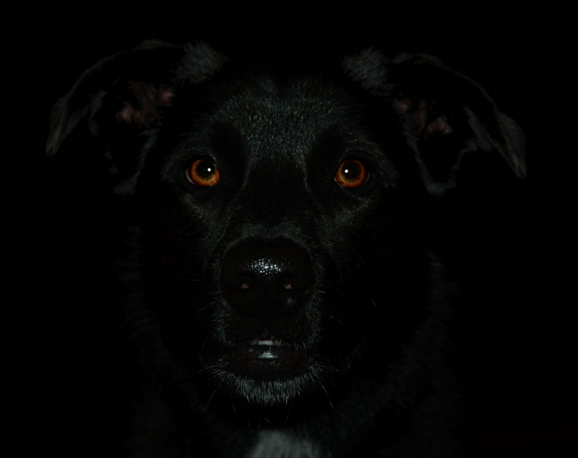
I thought this one would have done better. I guess part of my mistake was editing this at full size, and re-sizing at the end. The intensity of the highlights was greatly decreased when it was down-sized. I think it looked prety good full sized.
I took a look at this on a computer with a crappy old CRTthat has prety bad contrast (last two blocks on the contrast bar are one shade no matter what settings I change). On that screen the picture looked like it was all black. I'm wondering if some coments about it being to black are becuase of differences in contrast between my monitor and others. |
|
Comments Made During the Challenge  |
|
|
09/02/2007 11:43:28 PM |
|
 Photographer found comment helpful. Photographer found comment helpful. |
|
|
08/31/2007 03:59:12 PM |
|
| Photographer found comment helpful. |
|
|
08/30/2007 06:06:20 PM |
Your frame may be full but the darkness of the shot makes it appear as if your frame isn't full. Maybe not the best choice for the challenge theme...
TC |
|
| Photographer found comment helpful. |
|
|
08/29/2007 10:57:47 AM |
|
Unfortunately it's a bit too dark for my taste. Some shadows/highlights might have helped to bring out the fur a bit more. |
|
| Photographer found comment helpful. |
|
|
08/29/2007 12:41:29 AM |
|
| Photographer found comment helpful. |
|
|
08/28/2007 10:30:12 PM |
Since all my photo equipment was stolen and I am camera-less, I will spend time now voting...
Interest - 2
Theme Interp - 3
Technical Merit - 3
Personal Bias - 2
TOTAL - 10 |
|
| Photographer found comment helpful. |
Theme:
Classic /
System /
Light /
Dark
Home -
Challenges -
Community -
League -
Photos -
Cameras -
Lenses -
Learn -
Help -
Terms of Use -
Privacy -
Top ^
DPChallenge, and website content and design, Copyright © 2001-2026 Challenging Technologies, LLC.
All digital photo copyrights belong to the photographers and may not be used without permission.
Current Server Time: 10/05/2026 09:41:13 AM EDT.






 Add photograph to your favorites
 Add photographer to your favorites


