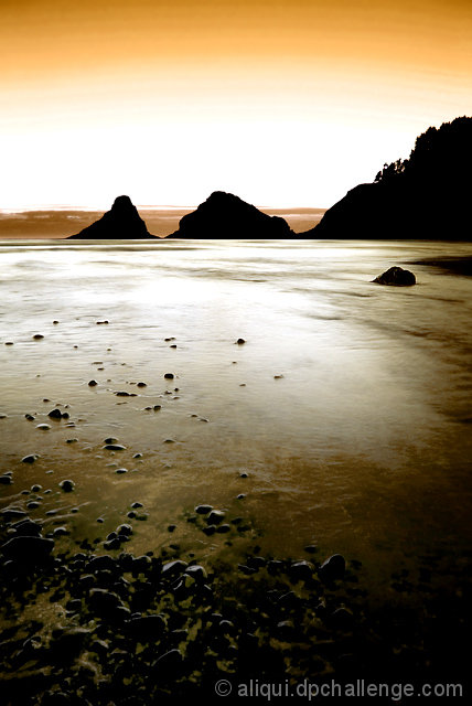
I'd be curious to see what your original looked like on this. To be honest, it looks like you jacked it up quite a bit in your post-processing. You've lost detail in the lower 2/3 of the sky, the mountains, most of the water and the bottom righthand corner. There's also some pretty strong banding across the upper part of the sky which generally indicates that you've pushed something farther than it can go. Compositionally, it pulls my eyes apart because the subjects are right at the bottom of the frame and then right near the top with nothing at all to look at in the middle. Even the mountains are only moderately interesting and appear a bit more like clipart because of the harsh lack of detail. A lower angle perhaps and a little lighter on the pp may have gained you some points. But there's your roughness. ;)
In response to your thread, I am leaving a comment. I think the white is what is "hurting" your image. I say "hurting" because it is not a bad image, but inattention may have kept the votes in the mid-range.
Our eyes are drawn toward bright areas of an otherwise dark or balanced photograph. So while there is beautiful color in the sky and interesting detail in the rocks and dark water, our eyes keep getting drawn to the middle of the photograph...to the white. Again, I would chalk up the mid-range score to inattention. Voters saw it, perhaps liked what they saw in the sky, rocks, and water, but could not hold focus long enough to appreciate these items more, as they are drawn to look at the white area.






 Add photograph to your favorites
 Add photographer to your favorites

 Photographer found comment helpful.


