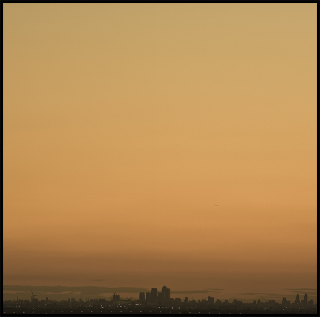
OK, this turned out to be my lowest scoring shot for a while. However, I am actually really pleased I entered it because of the amazing contrast in opinions regarding the negative space. This is a great example of how the voters opinions differ when presented with a picture slightly removed from the norm. I mean, this got 7 marks of ten, which surprised the hell out of me. And just read the comments. Yup, this was a great entry for me, not from a score point of view, but as a learning experience. Thanks everyone!!
Statistics
Place: 69 out of 176 Avg (all users): 5.7816 Avg (commenters): 6.3158 Avg (participants): 5.6167 Avg (non-participants): 5.8493 Views since voting: 1237 Views during voting: 322 Votes: 206 Comments: 24 Favorites: 2 (view)
Great photograph. As I'm learning, anything too challenging will freak out the voters - but as an artistic endeavour yours kicks ass. It is challenging because of the sheer scale of the negative space but that's what makes it a great photograph. I think some people like being challenged whereas others don't (i.e. some enjoy that discomfort and questioning - I know I do).
If this image was on a large canvas or a large framed print I could see this going for big money...especially because of the natural tones, making it easy to use in interior design. For me it's a very artistic image and the square crop is perfect for the symmetry. Very Zen....imagine this in a stockbrokers penthouse suite....think £2k.... ;)
Ah - this explains it - Location: Langdon Hills, Basildon, Essex, England
;-)
Seriously - I think that this is the kind of image that would sell really well. I like the plane especially. I would be interested in seeing this with a bit more local contrast - but advanced editing prob required.
I like the full stop in your title. Kind of a Ramsey-ish "London Skyline, "
God, the smog of London!! I would like to know where did you shoot this from?! =) I do like, just abi unsure if it would be better if it was a complete sillouette... 7
Not sure what to think of this one. I like the minimalist approach used but even taking that into consideration there still seems a lot of dead space at the top. I'd be tempted to crop off a third or a quarter off the top.





 Add photograph to your favorites
 Add photographer to your favorites

 Photographer found comment helpful.


