| Author | Thread |
Comments Made During the Challenge  |
|
|
01/27/2004 11:51:55 PM |
|
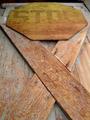
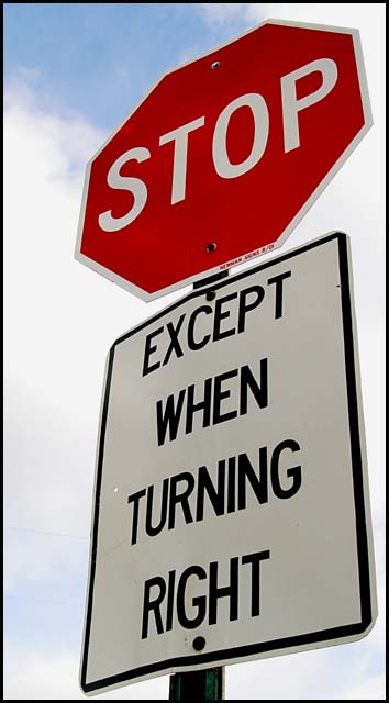
Clear and bright but just a tad too tight in the crop. A little more room on the left and bottom would be nice. |
|
 Photographer found comment helpful. Photographer found comment helpful. |
|
|
01/27/2004 03:54:03 PM |
|
nice composition, the sky is just right. nice color/exposure and focus. |
|
| Photographer found comment helpful. |
|
|
01/26/2004 04:54:09 PM |
|
..."And if and only if X = Y and Y = Z, then you can turn left" I know, confusing isn't it? I like this picture! Very clear, very sharp! |
|
| Photographer found comment helpful. |
|
|
01/25/2004 10:34:41 PM |
|
There is always some exception to the rule ;). Great clarity and vivid colour but no context |
|
| Photographer found comment helpful. |
|
|
01/24/2004 11:30:10 AM |
|
A pretty boring sign. But thoughtfully photographed to give a complementary background. Good angle, good colour, good sharpness and good exposure. |
|
| Photographer found comment helpful. |
|
|
01/22/2004 07:27:46 PM |
|
Not that confusing. =-) A little tightly cropped around the bottom. |
|
| Photographer found comment helpful. |
|
|
01/22/2004 06:03:33 PM |
|
Could the Stop sign be in better focus. Funny! |
|
| Photographer found comment helpful. |
|
|
01/22/2004 04:02:51 PM |
|
I would have waited until you could have gotten some blue sky behind that white sign. Good job. |
|
| Photographer found comment helpful. |
|
|
01/22/2004 10:06:31 AM |
|
I guess having a simple shot of a sign straight on is a little boring, but not so sure that having it slightly askew is much better. The first thing I think is that it's tilted. Beyond that the sky background is good, there's some nice blue to it. The image is also sharp and clear. I just do not find much interest with it, sorry. |
|
| Photographer found comment helpful. |
|
|
01/22/2004 06:45:34 AM |
|
Crisp and a twist on the "STOP" sign |
|
| Photographer found comment helpful. |
|
|
01/21/2004 03:42:30 PM |
|
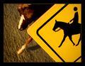
I've never seen that kind of sign.......it is a little confusing! |
|
| Photographer found comment helpful. |
|
|
01/21/2004 11:38:11 AM |
|
I'll say. Good idea shooting up toward the sky; it eliminates any background obstructions and creates a more interesting angle of view. |
|
| Photographer found comment helpful. |
|
|
01/21/2004 09:12:16 AM |
|
It's a great picture of a sign. |
|
| Photographer found comment helpful. |
Home -
Challenges -
Community -
League -
Photos -
Cameras -
Lenses -
Learn -
Help -
Terms of Use -
Privacy -
Top ^
DPChallenge, and website content and design, Copyright © 2001-2026 Challenging Technologies, LLC.
All digital photo copyrights belong to the photographers and may not be used without permission.
Current Server Time: 06/28/2026 11:58:19 PM EDT.