| Author | Thread |
Comments Made During the Challenge  |
|
|
01/27/2004 09:13:44 PM |
|
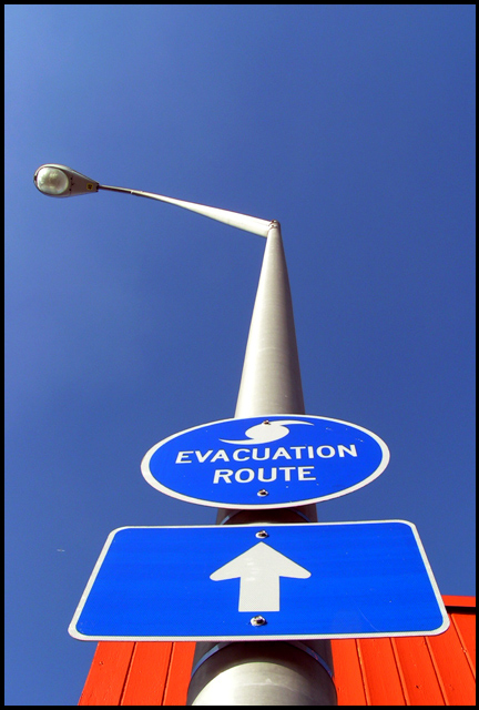
Great use of complimentary colours. Nice sharpness. It has almost abstract feeling. The vertical format for this image is perfect. Well done. |
|
 Photographer found comment helpful. Photographer found comment helpful. |
|
|
01/26/2004 10:32:47 PM |
|
Great POV and perspective. Great job. |
|
| Photographer found comment helpful. |
|
|
01/26/2004 10:14:31 PM |
Great perspective. Very well done. -9
|
|
| Photographer found comment helpful. |
|
|
01/26/2004 03:32:06 AM |
|
| Photographer found comment helpful. |
|
|
01/25/2004 06:56:47 AM |
|
Greta composition, minimalistic yet ironic and funny. |
|
| Photographer found comment helpful. |
|
|
01/25/2004 02:44:10 AM |
|
| Photographer found comment helpful. |
|
|
01/24/2004 01:31:40 PM |
|
Good Color and perspective. The bottom background is a bit distracting, but I realize that can't always be helped :) |
|
| Photographer found comment helpful. |
|
|
01/24/2004 08:30:23 AM |
|
Nicely framed. Good colours. Well done. |
|
| Photographer found comment helpful. |
|
|
01/24/2004 12:25:46 AM |
|
Great colors and composition, maybe more of the orange would be nice, but still, very nice |
|
| Photographer found comment helpful. |
|
|
01/23/2004 07:39:47 PM |
|
I like this photo, but it would have been better without that orange in the background. If the day was a little cloudy it would have been more interesting. |
|
| Photographer found comment helpful. |
|
|
01/23/2004 05:08:18 PM |
|
AWESOME pic...... Very creative......!!!!! :) |
|
| Photographer found comment helpful. |
|
|
01/22/2004 08:37:11 PM |
|
very nice, blue aginst red looks good |
|
| Photographer found comment helpful. |
|
|
01/22/2004 01:32:42 PM |
|
I love the blues with the red mixed in! Great shot |
|
| Photographer found comment helpful. |
|
|
01/22/2004 12:11:16 AM |
|
Nice composition and color! |
|
| Photographer found comment helpful. |
|
|
01/21/2004 09:43:08 PM |
|
keeps the eye busy! nice lines... |
|
| Photographer found comment helpful. |
|
|
01/21/2004 01:06:57 PM |
|
Perspective and color make this photograph. Nicely done. |
|
| Photographer found comment helpful. |
|
|
01/21/2004 01:05:19 PM |
|
I LOVE this one, the color, the simplicity of the composition and relative space. It took your innovative eye to get the viewer to interpret this sign as 'up the pole' where as a direct point of view wouldn't have been interesting at all. Great job |
|
| Photographer found comment helpful. |
|
|
01/21/2004 12:02:29 PM |
|
Oh, good perspective shot, humerous sign (in context: I'd climb the pole too if a tidal wave was coming) plus the nice orange background to add a complimentary color. Has it all! 10 |
|
| Photographer found comment helpful. |
|
|
01/21/2004 11:21:02 AM |
|
Humm, up this pole to badroom... Nice shoot, ironic and funny. great colors too. These red box on background is the only thing that no need to be there. |
|
| Photographer found comment helpful. |
|
|
01/21/2004 11:18:40 AM |
|
haha, cute. Only comment is that an exactly square on shot would have been slightly better. |
|
| Photographer found comment helpful. |
|
|
01/21/2004 10:42:23 AM |
|
Maybe that's in case of flood. lol Great colors and focus. |
|
| Photographer found comment helpful. |
|
|
01/21/2004 06:03:46 AM |
|
Shame about the building in the background. Good image though. |
|
| Photographer found comment helpful. |
|
|
01/21/2004 05:35:20 AM |
|
| Photographer found comment helpful. |
|
|
01/21/2004 03:56:11 AM |
|
if the red building wasnt there, it would be better, maybe crop off the bottom sign? |
|
| Photographer found comment helpful. |
|
|
01/21/2004 01:54:01 AM |
|
Would be nice if there were more negative space on the left. |
|
| Photographer found comment helpful. |
|
|
01/21/2004 12:36:42 AM |
|
Hilareous!!!! I love it! Could just imagine paniking people climbing this pole. |
|
| Photographer found comment helpful. |
|
|
01/21/2004 12:33:55 AM |
|
Really Like this point of view. Very cool shot |
|
| Photographer found comment helpful. |
Home -
Challenges -
Community -
League -
Photos -
Cameras -
Lenses -
Learn -
Help -
Terms of Use -
Privacy -
Top ^
DPChallenge, and website content and design, Copyright © 2001-2026 Challenging Technologies, LLC.
All digital photo copyrights belong to the photographers and may not be used without permission.
Current Server Time: 06/28/2026 07:03:27 AM EDT.