| Author | Thread |
|
|
01/28/2004 03:31:47 AM |
|
the reasons i took the picture this way are because it was raining all the time, i'm way too busy with college applications and school, and i knew this might stand out from all the others....just thought it'll be interesting to see what people say...thanks for the comments though!! |
|
Comments Made During the Challenge  |
|
|
01/26/2004 05:47:12 AM |
|
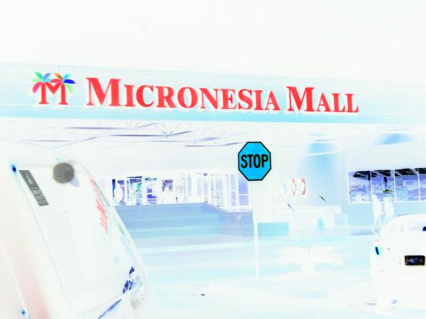
maybe a little bit overexposed. |
|
|
|
01/26/2004 03:04:37 AM |
|
Over edited in post production. |
|
|
|
01/25/2004 02:33:04 AM |
|
Interesting use of negative... |
|
|
|
01/24/2004 09:10:18 AM |
|
I do like the way the signs pop out at you, but the over proccesed shot thing really doesn't work for me. It may be better just cropping around the stop sign? The mall sign makes me feel like I'm looking at an advertisement. |
|
|
|
01/23/2004 09:45:25 PM |
|
interesting, but I think a straightforward image would be more effective. |
|
|
|
01/22/2004 12:38:44 PM |
|
The photo appears to underexposed (assumming negative effect). |
|
|
|
01/22/2004 11:46:54 AM |
|
This is rather a unique post processing technique photo. Not sure how you did it, but it really does make the signs prominent. |
|
|
|
01/21/2004 10:40:46 PM |
|
A curious choice of using invert... |
|
|
|
01/21/2004 04:35:27 PM |
|
Interesting negative effect! Nice and sharp. |
|
|
|
01/21/2004 03:04:44 PM |
|
This doesn't do anything for me. |
|
|
|
01/21/2004 01:07:16 PM |
|
I always applaud new techniques but the photo itself which you started with isn't great. A cool effect on an 'okay' pic is still only 'okay' but with some work I can see this working next time. |
|
|
|
01/21/2004 12:50:35 PM |
|
Not sure what the point of the effect is here... |
|
|
|
01/21/2004 11:05:54 AM |
|
Yeah, no conventional! May be I prefer the conventional. |
|
|
|
01/21/2004 09:16:31 AM |
|
Blinding...maybe the negative way is not the right way to go with this photo. |
|
|
|
01/21/2004 02:11:16 AM |
I don't like psychedelic...
TC |
|
|
|
01/21/2004 01:56:58 AM |
|
|
|
01/21/2004 01:13:24 AM |
|
Don't care for the Printshop effects used here, would have been better in it's original colors. |
|
|
|
01/21/2004 12:21:58 AM |
|
very bizzare effect you have put on this, way to distracting to even be interesting |
|
Home -
Challenges -
Community -
League -
Photos -
Cameras -
Lenses -
Learn -
Help -
Terms of Use -
Privacy -
Top ^
DPChallenge, and website content and design, Copyright © 2001-2026 Challenging Technologies, LLC.
All digital photo copyrights belong to the photographers and may not be used without permission.
Current Server Time: 06/28/2026 04:30:31 AM EDT.