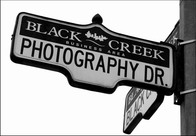
after having no visible background to go with at the angle i was shooting, here you have it, just a simple picture of a street sign. kinda boring if you ask me, but appropriate to the challenge.
adjusted levels, desaturated, and a minor crop off the post.
Statistics
Place: 40 out of 202 Avg (all users): 5.9176 Avg (commenters): 8.0000 Avg (participants): 6.0000 Avg (non-participants): 5.8511 Views since voting: 1102 Votes: 255 Comments: 13 Favorites: 2 (view)
Very appropriate sign! I like the use of black and white, it gives it a nice classy look, and I think that way the white overcast sky in the background is not as prominent, it just looks like a plain background. The tilt of the sign is a little offputting, but I can see the post is straight and so there was probably not much you could do with it. Very prominent and clear and has relevancy, good image!
You certainly came to the right place to find a sign for this challenge. Nice rendition of the sign; I like the sense of depth that the low angle gives and the nice, tight crop.





 Add photograph to your favorites
 Add photographer to your favorites


 Photographer found comment helpful.


