| Author | Thread |
Comments Made During the Challenge  |
|
|
01/26/2004 10:30:33 PM |
|
Very fun for the DPChallenge. |
|
|
|
01/26/2004 03:23:48 AM |
|
Very nice shot - love that it's black and white, fits really well. |
|
|
|
01/26/2004 12:31:25 AM |
|
But of course! Where else?! "Photography Dr." Very appropriate for this challenge! Very nice image! I like it a lot! |
|
|
|
01/25/2004 08:01:03 PM |
|
I really like the composition of this shot...nice work. |
|
|
|
01/25/2004 02:25:08 AM |
|
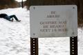
Great sign - good sharpness and contrast. The diagonal helps strengthen it as well. good work. |
|
|
|
01/24/2004 08:02:16 AM |
|
A rather boring sign with an unexciting background. So I give you a 6 for doing so well with poor material. |
|
|
|
01/22/2004 06:21:18 PM |
|
I like the composition and black and white. Nice job. |
|
|
|
01/22/2004 11:08:00 AM |
|
|
|
01/21/2004 01:14:35 PM |
|
Very appropriate sign! I like the use of black and white, it gives it a nice classy look, and I think that way the white overcast sky in the background is not as prominent, it just looks like a plain background. The tilt of the sign is a little offputting, but I can see the post is straight and so there was probably not much you could do with it. Very prominent and clear and has relevancy, good image! |
|
 Photographer found comment helpful. Photographer found comment helpful. |
|
|
01/21/2004 11:59:27 AM |
|
way to strike home with the voters! |
|
|
|
01/21/2004 11:54:28 AM |
|
You certainly came to the right place to find a sign for this challenge. Nice rendition of the sign; I like the sense of depth that the low angle gives and the nice, tight crop. |
|
| Photographer found comment helpful. |
|
|
01/21/2004 11:24:33 AM |
|
Nicely done - well composed. |
|
|
|
01/21/2004 08:42:26 AM |
|
Home -
Challenges -
Community -
League -
Photos -
Cameras -
Lenses -
Learn -
Help -
Terms of Use -
Privacy -
Top ^
DPChallenge, and website content and design, Copyright © 2001-2026 Challenging Technologies, LLC.
All digital photo copyrights belong to the photographers and may not be used without permission.
Current Server Time: 07/04/2026 11:54:58 AM EDT.