| Author | Thread |
Comments Made During the Challenge  |
|
|
09/15/2002 01:53:00 PM |
|
nice photo, great tonal range and lighting. |
|
 Photographer found comment helpful. Photographer found comment helpful. |
|
|
09/14/2002 08:14:00 PM |
Composition: Subject Placement, Cropping, Background6,
Technical: Focus, Exposure, Lighting, Processing6,
Appeal: Is it Interesting, Motivating, Etc.? 6,
Total Averaged Rating6. Autool
|
|
| Photographer found comment helpful. |
|
|
09/14/2002 02:38:00 PM |
|
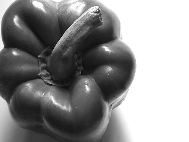
Excellent use of negative space! |
|
| Photographer found comment helpful. |
|
|
09/14/2002 02:06:00 PM |
|
| Photographer found comment helpful. |
|
|
09/14/2002 12:09:00 PM |
|
Lovely shape, and good composition. The black and white works, but I love green and red so would like it in either case had it been in color. Good luck in the callenge. Gracious aka Grayce |
|
| Photographer found comment helpful. |
|
|
09/13/2002 07:58:00 PM |
|
Great use of black and white! I feel like the cropping is adding too much tension where the pepper meets the borders, though. I'd like to see it zoomed in or out more. I gave you a 9, but I really wanted to give a 10. |
|
| Photographer found comment helpful. |
|
|
09/13/2002 06:33:00 PM |
Great photo. Nice perspective I like the contrast too. The composition/cropping does very well for this. 9
Ruthann |
|
| Photographer found comment helpful. |
|
|
09/13/2002 05:34:00 PM |
|
I think this would have looked better in color. It would give more pop to the picture. |
|
| Photographer found comment helpful. |
|
|
09/13/2002 10:14:00 AM |
|
very simple and very elegantly done. good use of negative space and black and white. i think a tad more light could have helped this, as it loses a bit of detail in the shadows. it might have helped to give it a tonal range. 7. |
|
| Photographer found comment helpful. |
|
|
09/13/2002 05:21:00 AM |
|
|
|
09/13/2002 03:37:00 AM |
|
Love the composition. The lighting is also very good. Thstalk could have been abit sharper. Overall very good. 8-Martin |
|
| Photographer found comment helpful. |
|
|
09/12/2002 09:20:00 PM |
|
Nice compostion. I like the black and white but I think this could use a levels adjustment. There are not area approaching pure black. Also what may have looked interesting (too late now of course) is to desaturate the color, and then increase the color on one channel, the same color as the pepper. Just an idea. Good crop, and other technical aspects are great. Zeissman |
|
| Photographer found comment helpful. |
|
|
09/12/2002 11:53:00 AM |
|
As a big fan of Weston I can appreciate this. Very nice control of contrast and highlights. A bit more texture in this shot would have really spiced it up for me..still..very high quality..8...hokie |
|
| Photographer found comment helpful. |
|
|
09/11/2002 11:18:00 AM |
|
| Photographer found comment helpful. |
|
|
09/11/2002 09:47:00 AM |
|
very nice idea, would've looked good in color, too, i'm sure. i like the composition, but your lighting is a little uneven, too dark around the stalk and highlights in various places. natural light (but not direct) usually works best for me. or some tissue in front of your light source to diffuse the light a bit. -- gr8photos (5) |
|
| Photographer found comment helpful. |
|
|
09/10/2002 06:24:00 PM |
|
Peppers are so beautifully colored, that I have to wonder why you went with black and white on this photo. The lighting is a bit rough toward the top of the photo, but not distracting from the photo. I think that the angle and framing are good. The focus and clarity are good as well. Overall nice photo. Good luck in the challenge. ~HBunch7187~ |
|
| Photographer found comment helpful. |
|
|
09/09/2002 05:01:00 PM |
|
Couldn't be better :) = 10 - jmsetzler |
|
| Photographer found comment helpful. |
|
|
09/09/2002 01:35:00 AM |
|
I like your use of b&w here. |
|
| Photographer found comment helpful. |
Home -
Challenges -
Community -
League -
Photos -
Cameras -
Lenses -
Learn -
Help -
Terms of Use -
Privacy -
Top ^
DPChallenge, and website content and design, Copyright © 2001-2026 Challenging Technologies, LLC.
All digital photo copyrights belong to the photographers and may not be used without permission.
Current Server Time: 06/27/2026 04:36:17 PM EDT.